
Legend
Grow App: An app to track customers, their activity, and how they’re growing.
Vista: A customisable canvas that shows you everything that’s going on.
Record: A single piece of information, like an issue, ticket, or opportunity.
Attributes: The details inside a record: like status, owner, or priority.
Account: A company or customer you’re working with.
Primary Account: The main account where all data is merged and retained.
Secondary Account: The duplicate account that gets merged into the primary.
Turing: An AI assistant that helps you search, understand, and take action.
Purple (Turing AI Colour): Highlights where AI is working behind the scenes.
Introduction
Many teams migrating to DevRev bring in their historical data through Bridge, our patented Knowledge Graph migration feature. It’s powerful but when data is pulled from multiple sources, there’s always a chance of overlap.
That means the same customer or company might get created more than once, each with slightly different information. What looks like a clean import can quickly lead to fragmented records, split context, and operational headaches down the line.
In the Grow App, this wasn’t just a technical problem, it was a user-facing one. Users struggled to tell which account was the source of truth.
Record-cleanup (merge operation) fixes all of this. It brings clarity back to customer records and gives user the confidence that what they’re looking at is real, current, and complete.
Challenges
Most users didn’t even realise duplicates existed. The interface offered little context, and the cost of making a wrong merge are high.
This led me to ask:
How might we surface duplicates in a way that feels helpful and not disruptive?
How might we help users compare accounts with full context and confidence?
How might we communicate the direction and permanence of a merge?
How might we assist users in making the right decision?
How might we design a workflow that supports edge-cases?
Solution
I reimagined the deduplication journey from the ground up.
The experience begins with gentle nudges: contextual toasts and inline banners surface potential duplicates without disrupting the user’s workflow.
Once inside, a focused review flow presents one pair at a time with side-by-side comparisons, merge direction cues, and clear actions to merge or dismiss. A custom confirmation modal adds one final layer of clarity ensuring users know exactly what they’re committing to before taking irreversible steps.
AI supports quietly in the background: automatically surfacing the most relevant differences between records at the top of the view, so users can make faster, more confident decisions. Smart filters and search tools give users the power to zoom in on specific accounts and clean up.
This project highlights the key features. But there’s more behind the scenes: iterations, design thinking, and decisions that shaped the journey.
Book a call for a deeper walkthrough.
The Nudge
Not all users actively look for duplicates so I designed subtle prompts to surface them at the right moments.
Suggestion Toasts: While navigating Grow Vista, a quiet toast highlights potential duplicates working silently in the background.
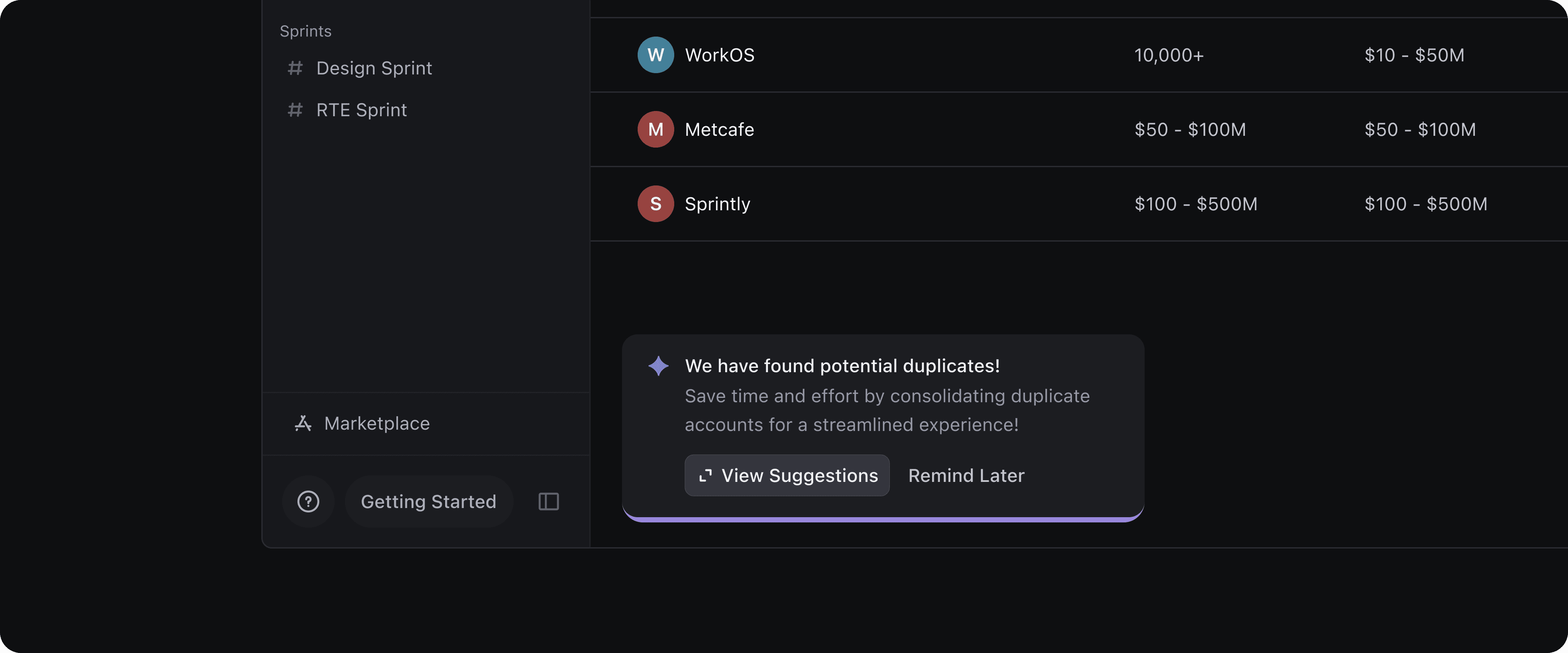
Suggestion Banners: For stronger signals, inline banners appear within Vista, prompting users to review duplicates right where they’re working.
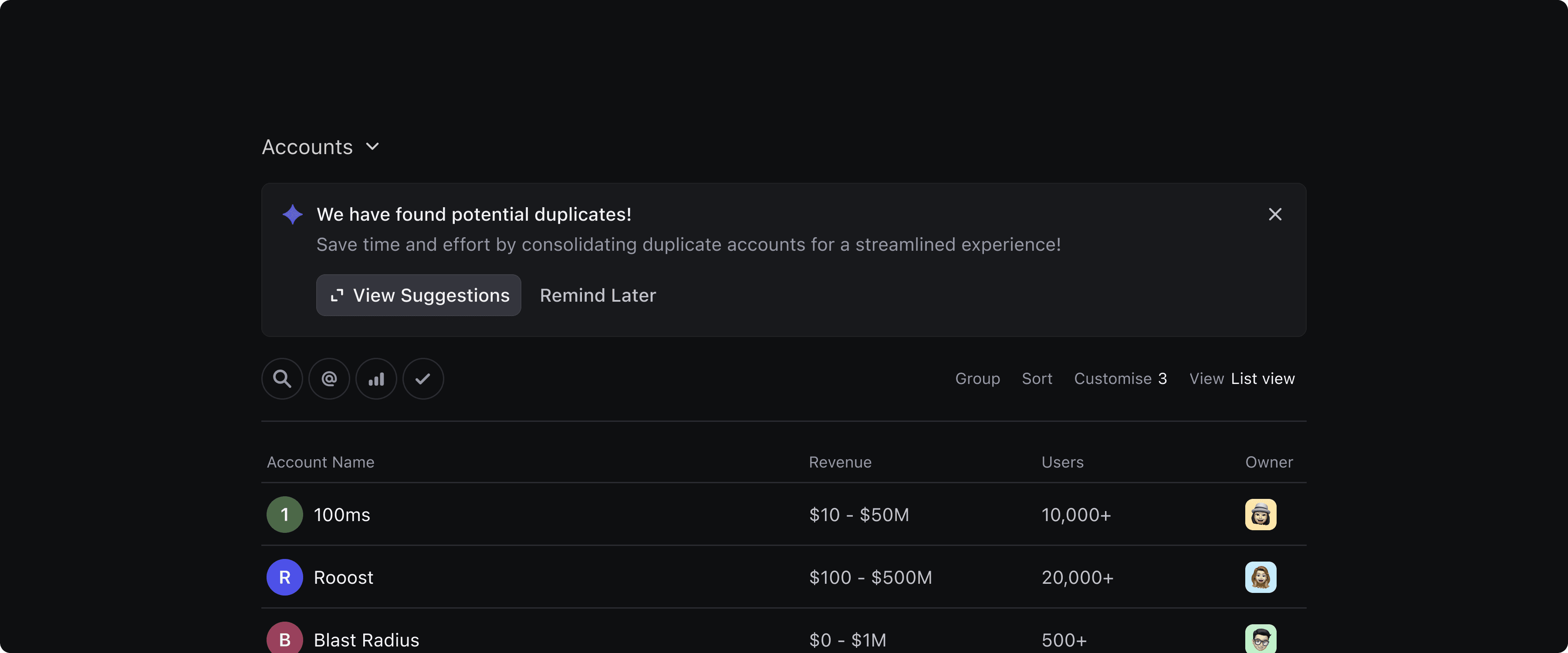
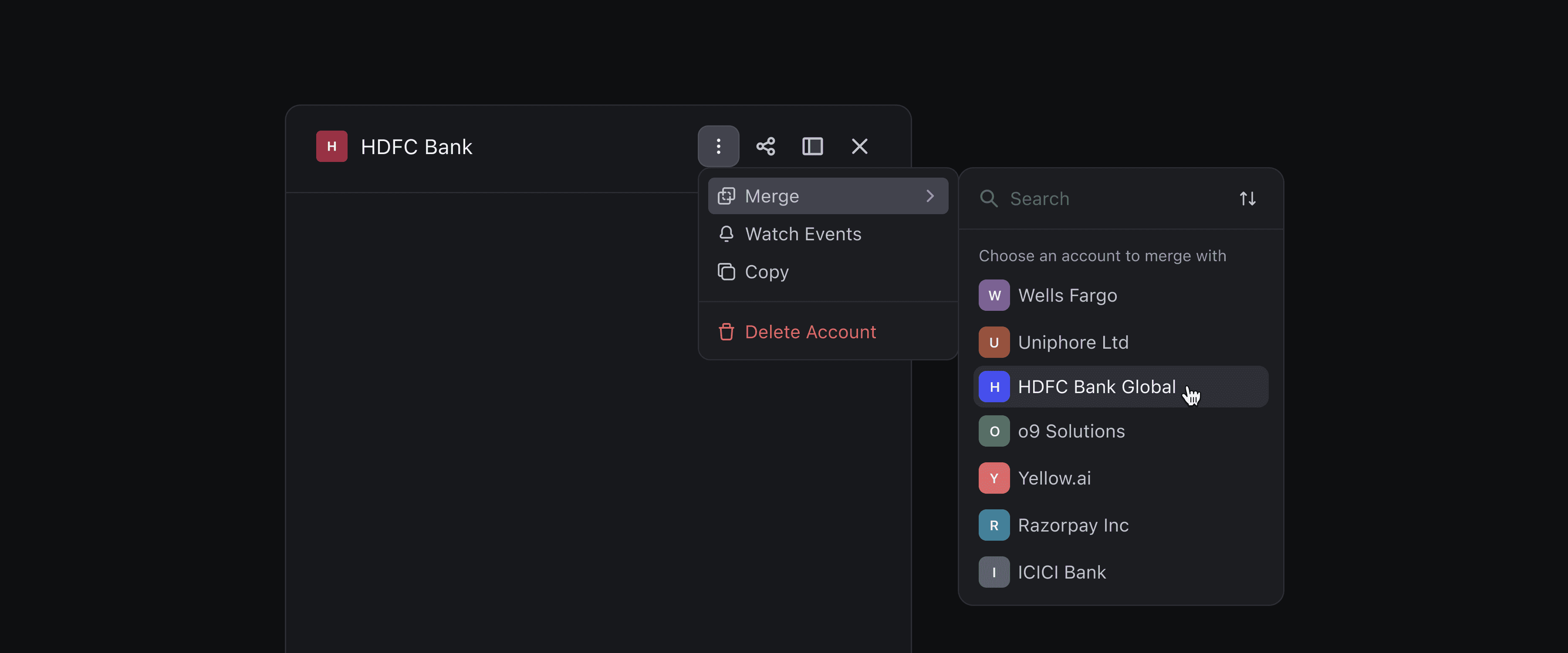
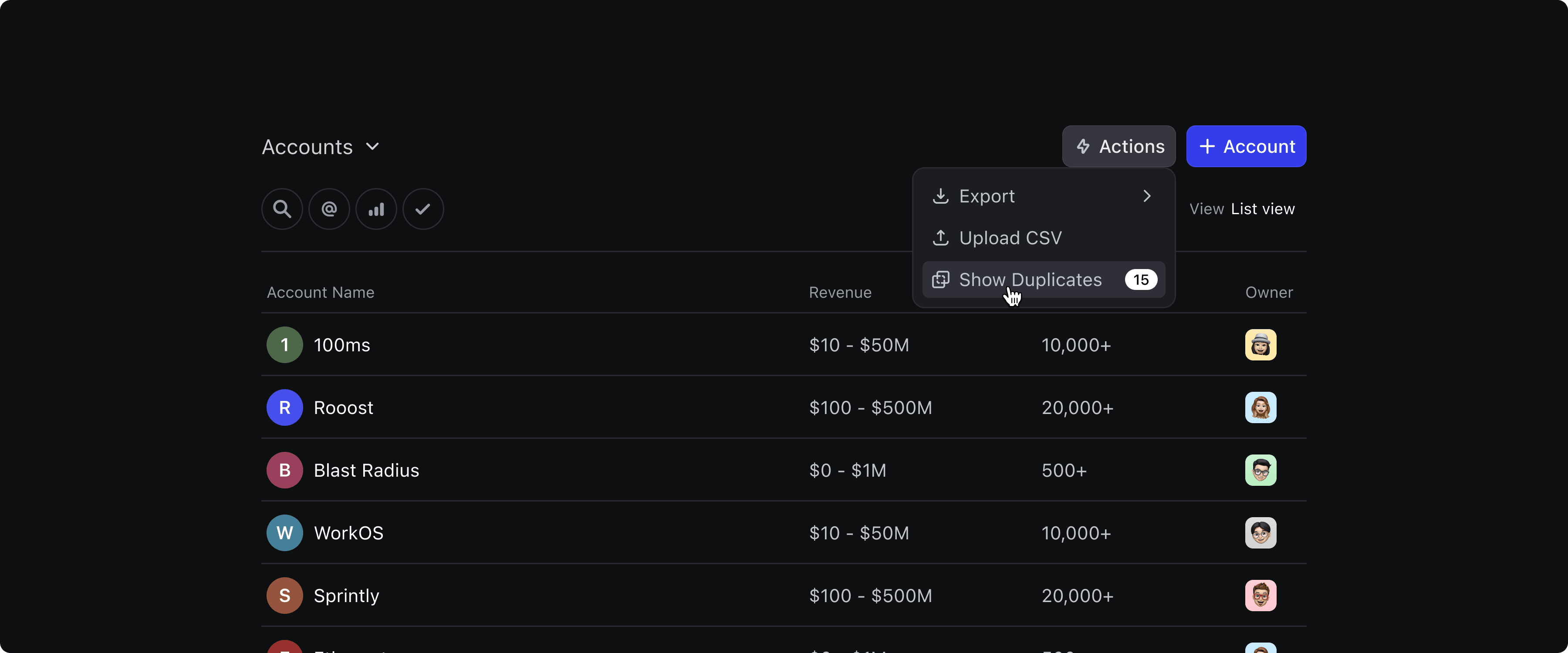
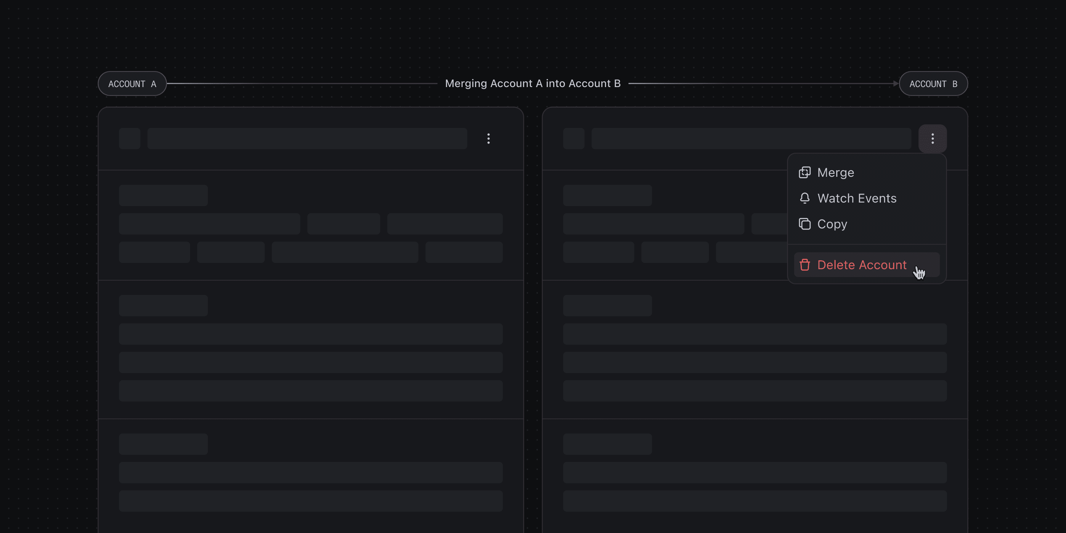
In addition, users can manually trigger the merge flow; either from the three-dot menu on a record or via the action menu at the Vista level to access a focused merge view.
Suggestions on Record
I also designed suggestions within the record view. If an account has a duplicate, users are prompted to review it directly from the page.
When multiple duplicates are detected, users can step through each pair one by one in a focused merge view.

Focus view
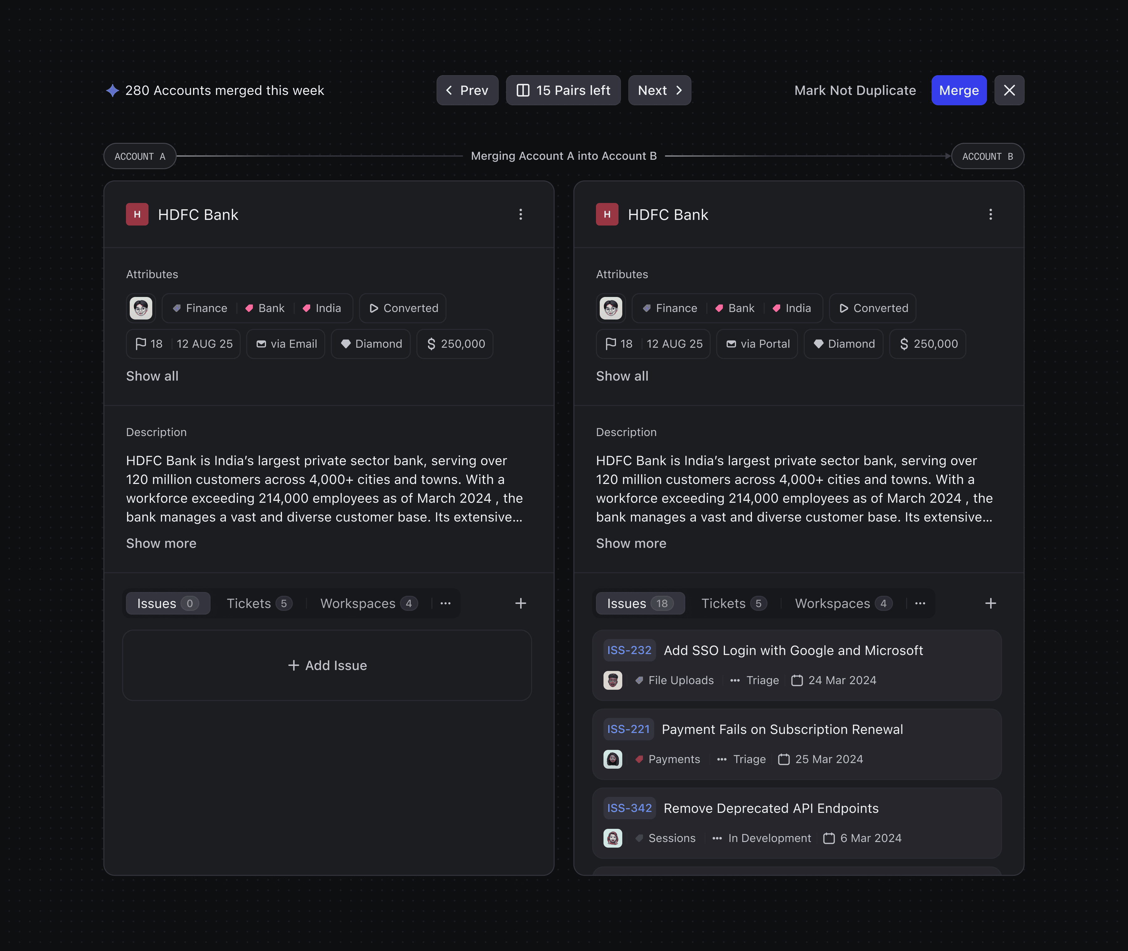
Merging accounts is a high-stakes decision. To honour the sensitivity, I introduced a dedicated focus view for duplicate resolution:
The interface is intentionally stripped of distractions. Users are presented with just one pair at a time, along with clear, contextual options:
This focused environment encourages thoughtful action and helps prevent errors.
Merge Controls
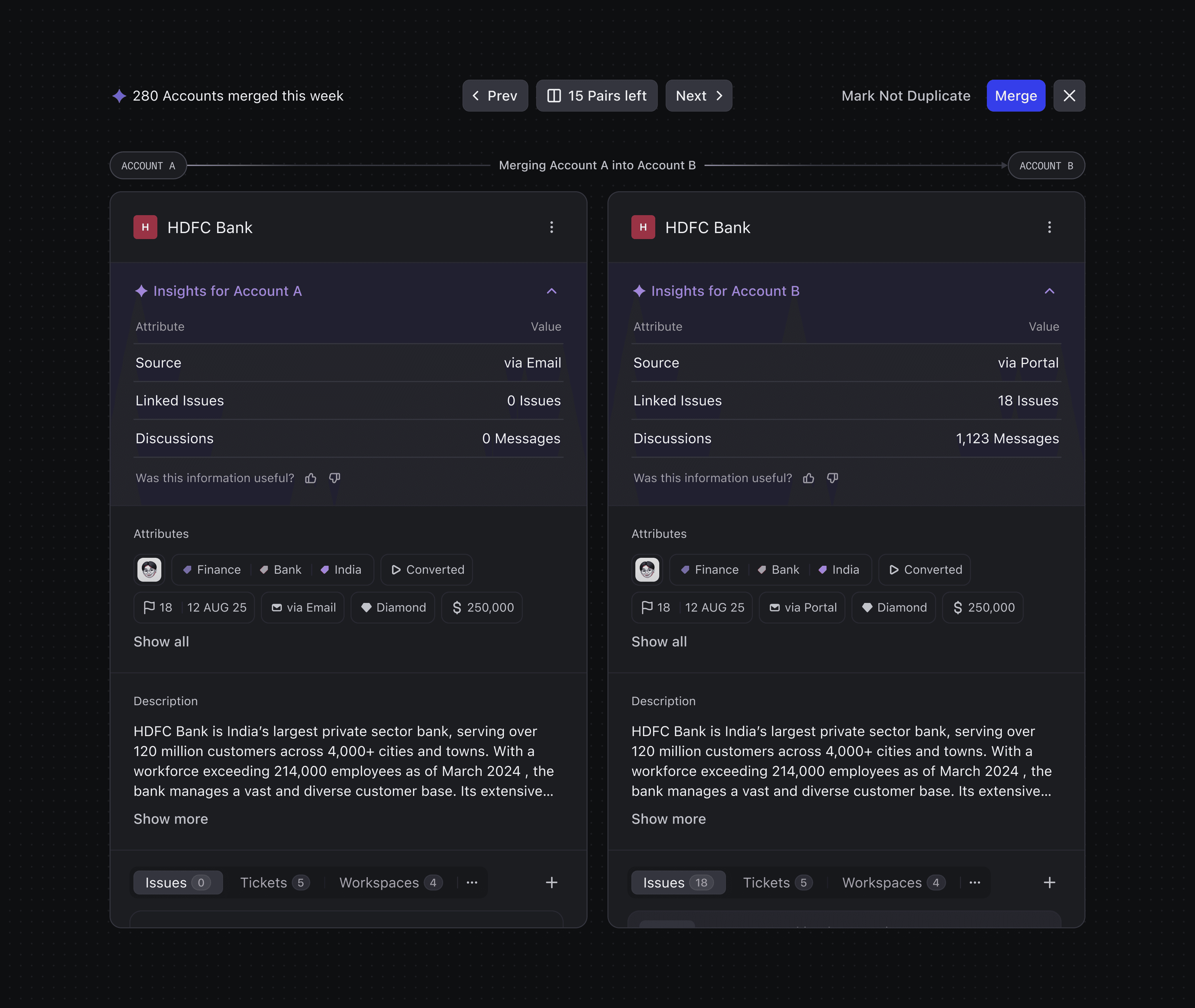
To emphasise the importance and usefulness of our feature, I decided to surface a quick stat “X accounts merged this week” as a nudge to take action.
The merge view is equipped with intuitive controls that guide users through the process:
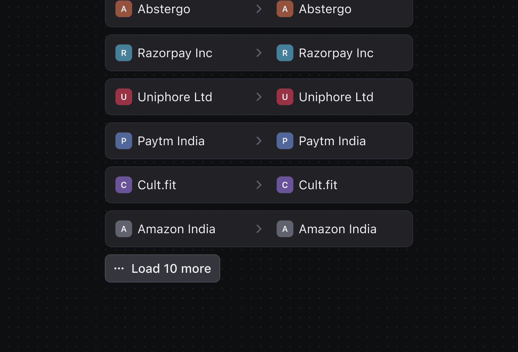
Navigation: Users can move through duplicate pairs using next and previous buttons. A visible pair count helps track progress and clicking it reveals a searchable list of all detected pairs.
Confident it’s a duplicate? Tap Merge to combine the records instantly.
Sure they’re not the same? Use Mark as not duplicate to dismiss the suggestion.
Not sure yet? Simply skip to the next pair.
Done for the day? Hit close button to exit the flow.

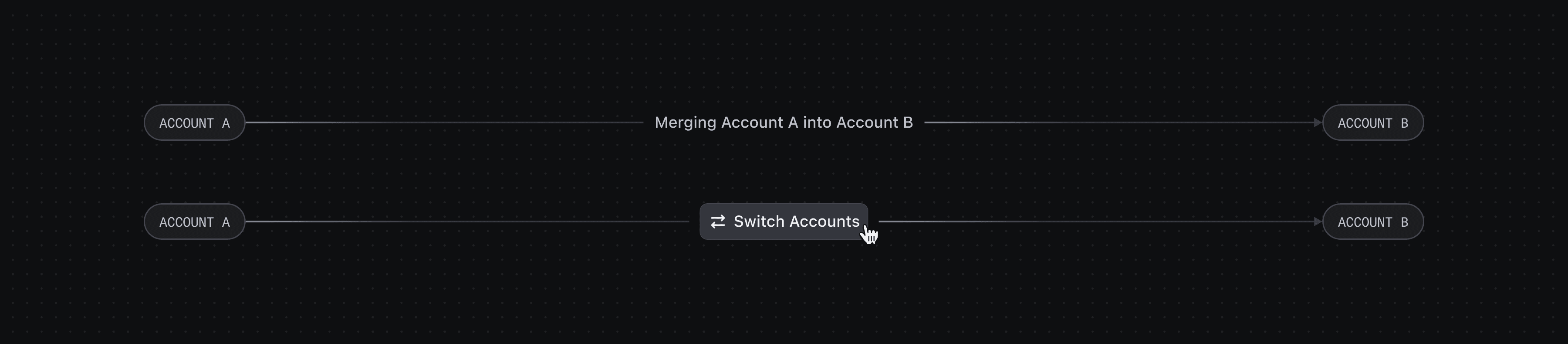
Context Bar
One of the common points of confusion during account merging was understanding which record was being retained and which one would be merged into it.
To address this, I introduced an Context Bar that visually guides users through the merge direction:
A subtle left-to-right animation indicates the flow of data; from the account being merged into the primary record.
Users can switch the direction of the merge at any point, offering full control.
Side by Side
Resolving duplicates often comes down to spotting subtle differences. Humans naturally compare things side by side; that’s how we spot differences.
Parallel Browsing: To support this, the merge view offers parallel browsing, allowing users to view both accounts side by side. They can scan through details, make edits, and even tag peers in comments if they need a second opinion.

Putting It All Together
Once in the focused merge view, users are presented with a side-by-side comparison of both accounts.
Each section is clearly labeled, and the merge direction is prominently shown via the context bar.
Users can browse through fields, add comments, or make edits directly within this view.
With all necessary merge controls in place: Search pairs, next, previous mark or mark as not duplicates, users are equipped to make the correct decision.
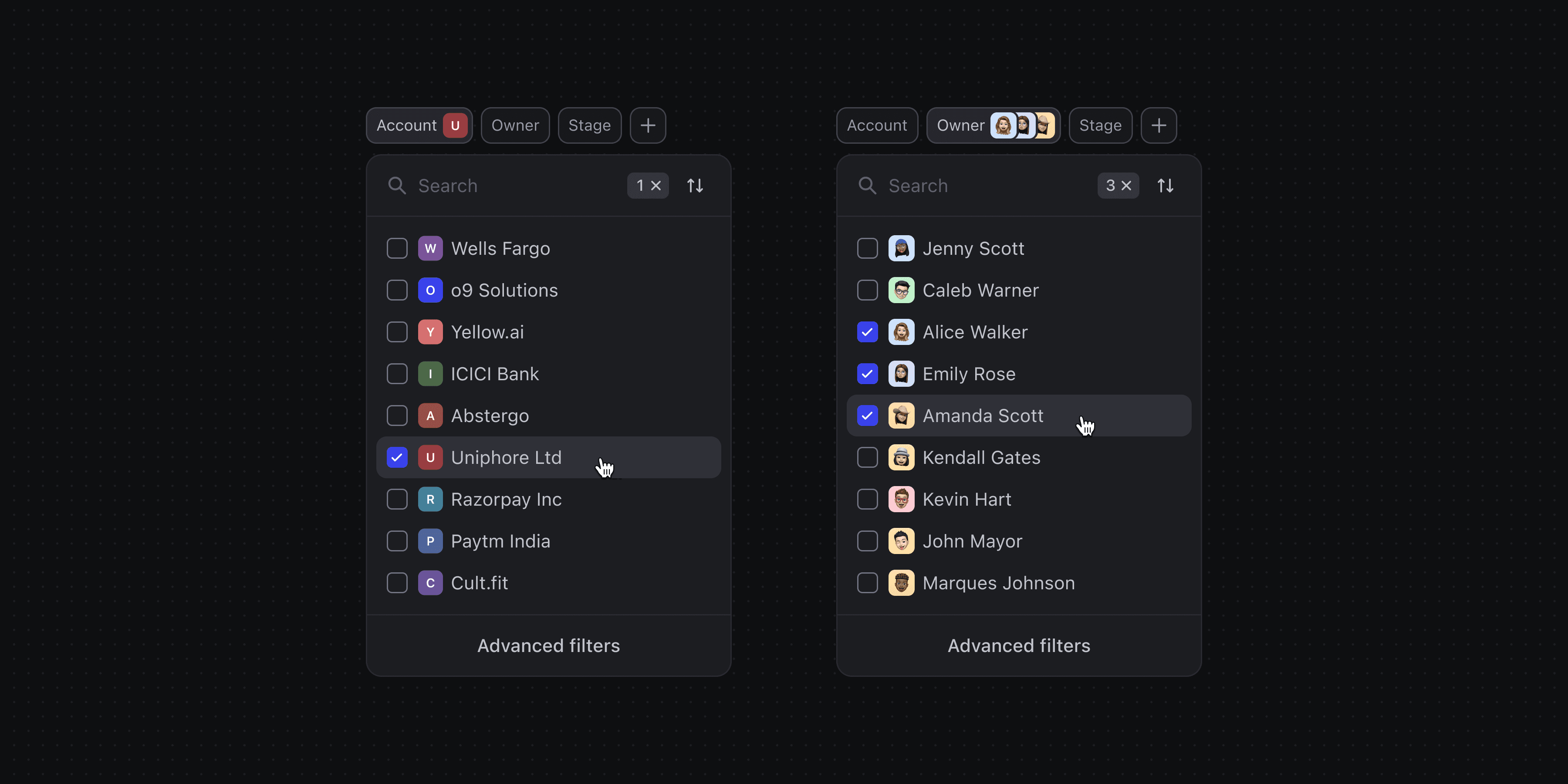
Search & Filter
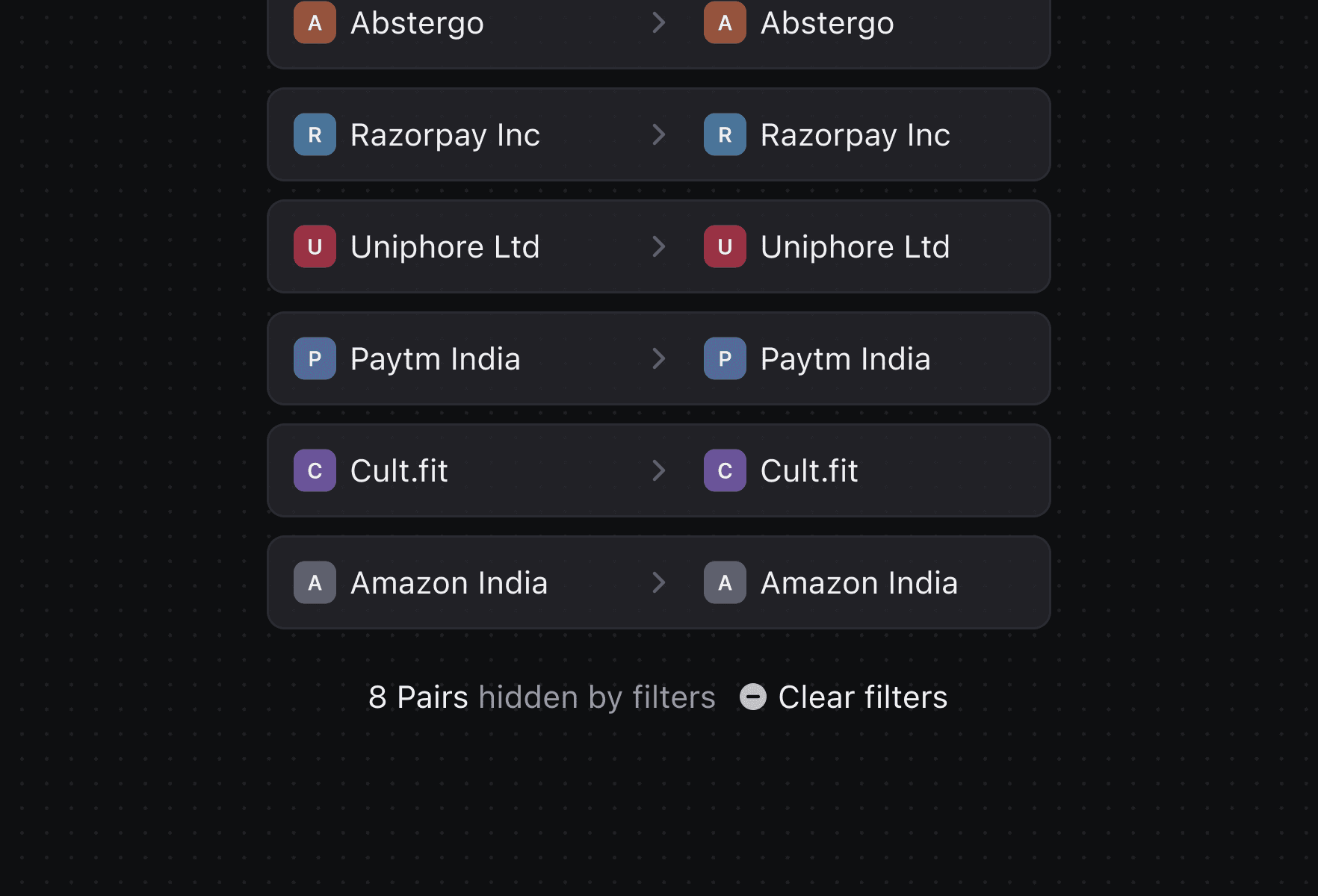
To make the deduplication flow more efficient, I integrated search directly into the duplicate pairs list. Users can search for any account to check if it has duplicate suggestions pending review.
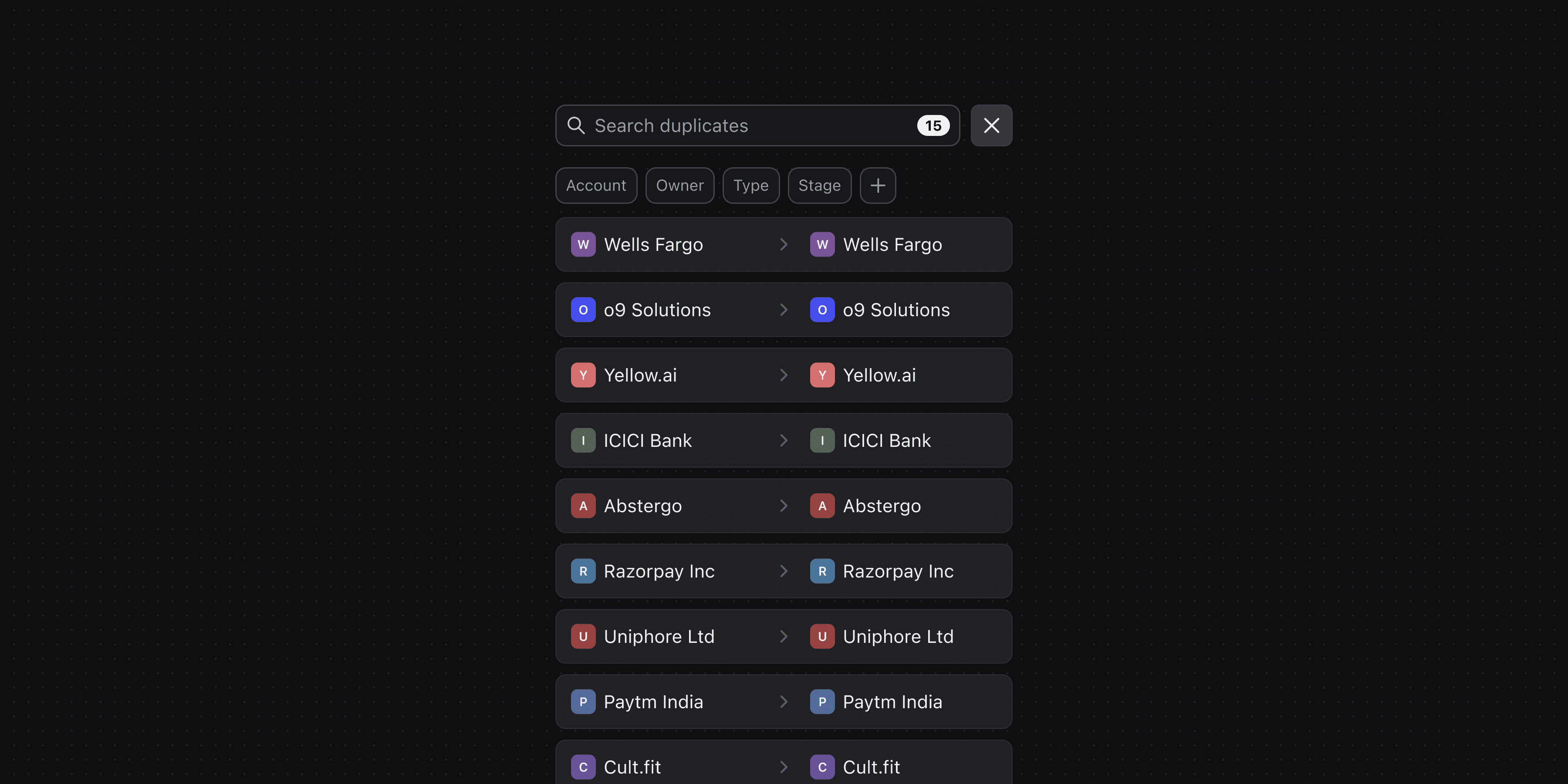
Filters allow narrowing down results by account, owner, or even just those assigned to you. Making it easy to focus on the task at hand.
The AI Bit
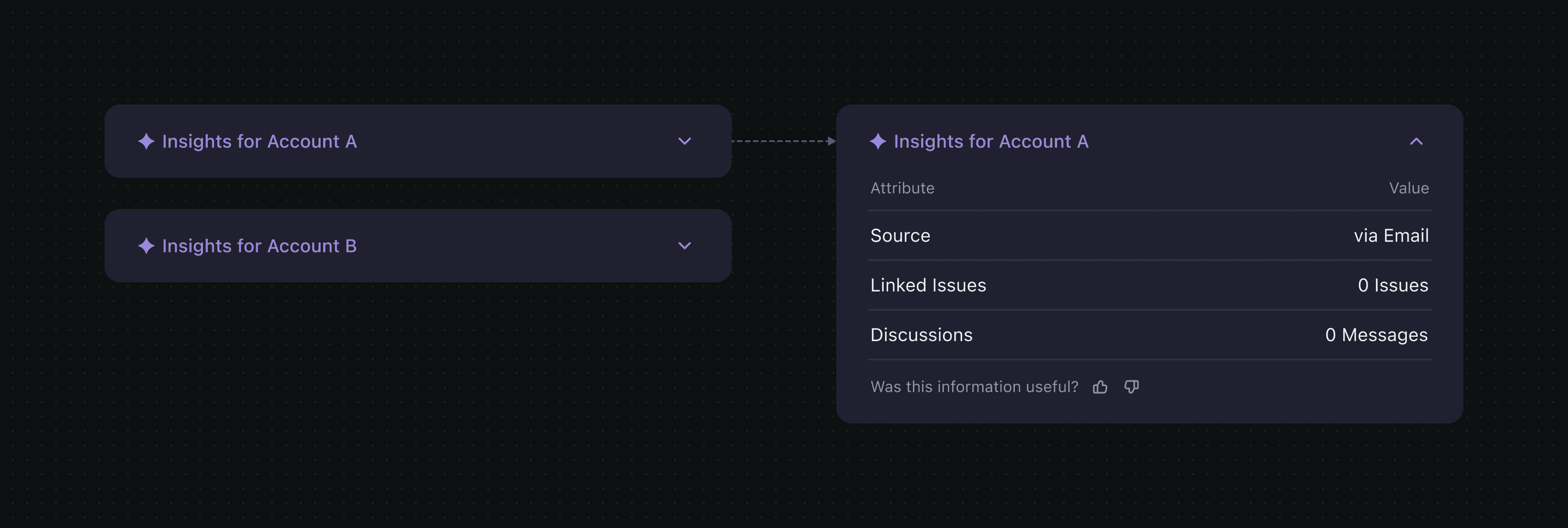
While users have full control over the merge process, I wanted to assist their decision-making with intelligent insights.
That’s where AI comes in.
I designed a layout that dynamically surfaces the key differences between two records at the top. Whether it’s a mismatch in email, phone number, or owner, users can immediately see what sets the accounts apart.
Since every field in a DevRev record is indexed, the dev team confirmed this was not only feasible but also fast. By removing the need to scroll and scan, AI makes the merge process smarter and quicker.
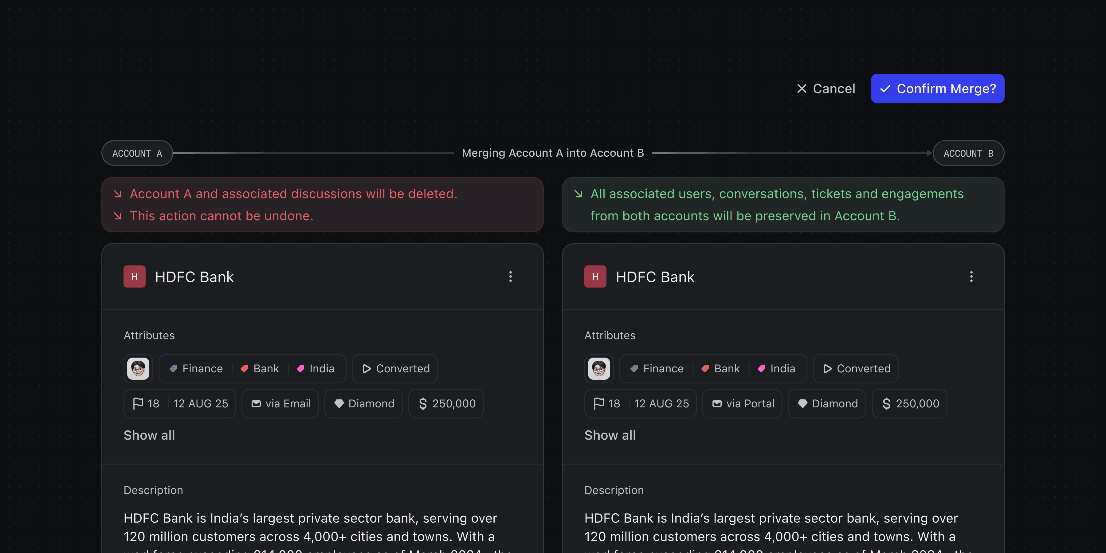
Confirmation Modal
A standard modal wasn’t enough.
Given the high-stakes and irreversible nature of merging, I designed a custom confirmation step to designed to eliminate doubts before final action.
The confirmation view shows clear visual warnings for each account; highlighting exactly which data will be retained and which fields will be overwritten, and from which account.
Post-merge Experience
After a merge, I wanted to reassure users that everything went as intended without breaking their flow.
A subtle animation paired with a relevant message signals that the merge is in progress. Users can choose to wait or move on to the next pair.
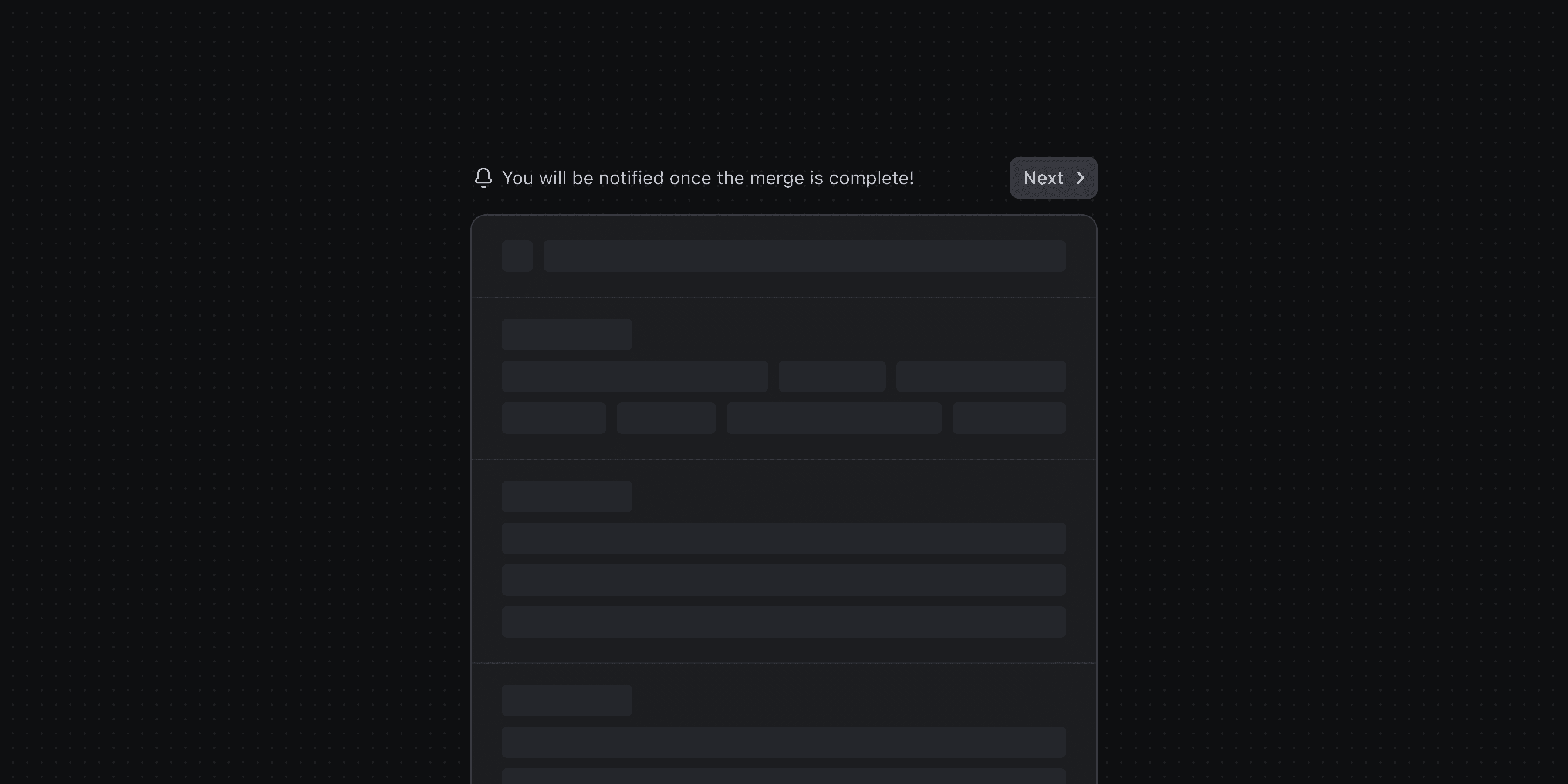
If users choose to wait, the status updates live, ending with a “Merge Complete” message when successful. From there, they can either view the primary record or move straight to the next pair.
If something goes wrong, a “Merge Unsuccessful” message appears instead, with an option to inspect the error.
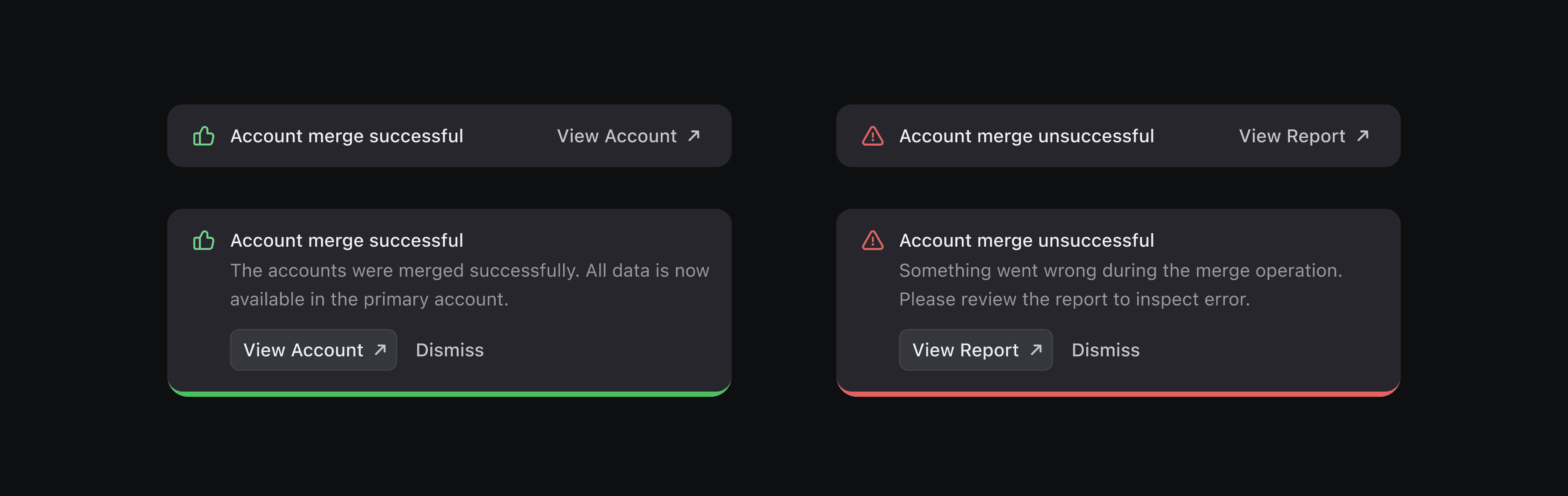
Toast
To keep users informed without breaking their flow, I designed toasts to deliver updates during the merge process.
In Focus View, a small toast confirms when a previous pair has been successfully merged.
While navigating DevRev, a larger toast appears, reassuring users that a background merge completed smoothly.
Since merges are irreversible, no undo option is shown: setting clear expectations. If something goes wrong, similar “Unsuccessful merge” toast appears with a View Report button, allowing users to inspect the error in detail.
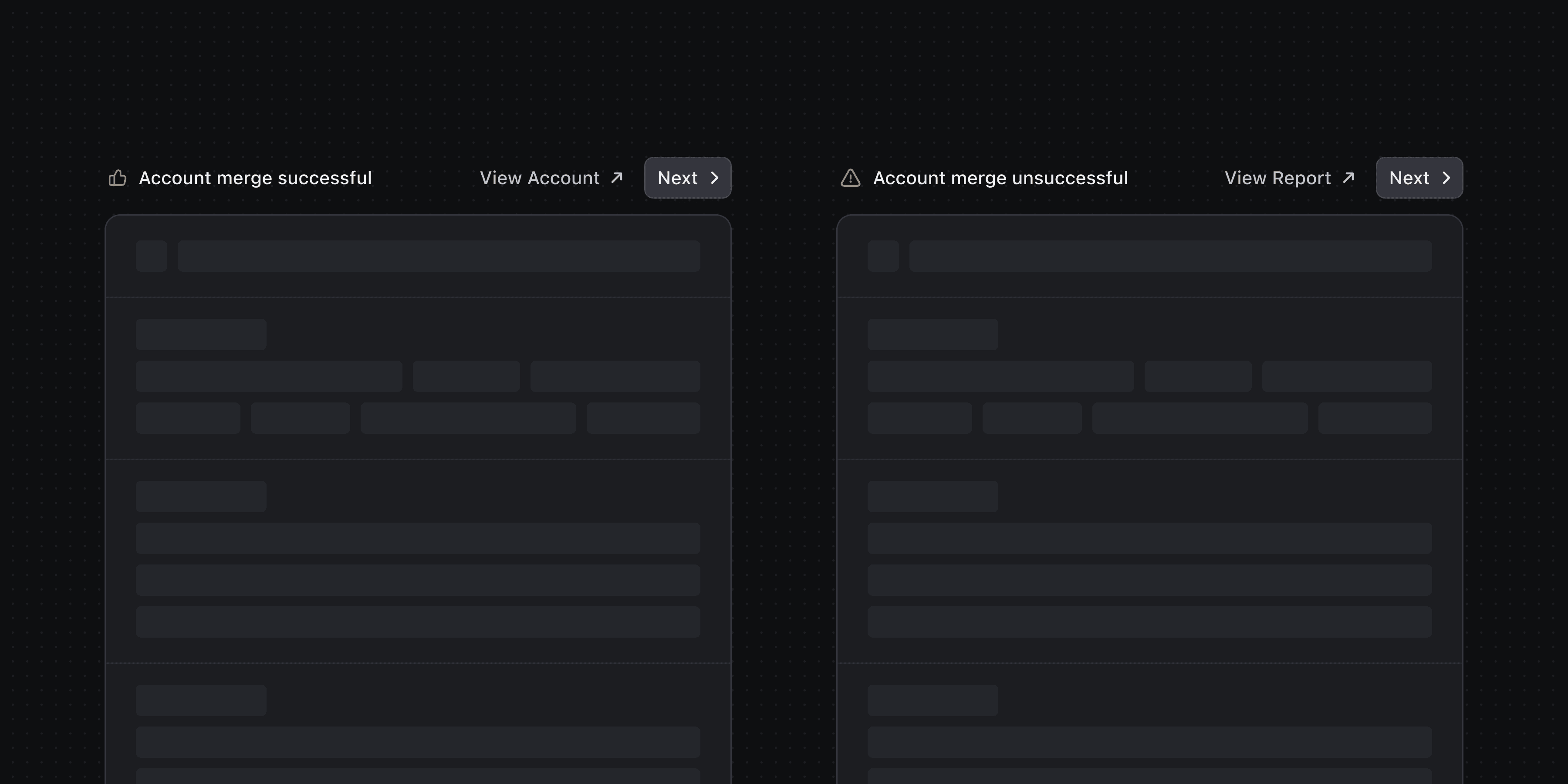
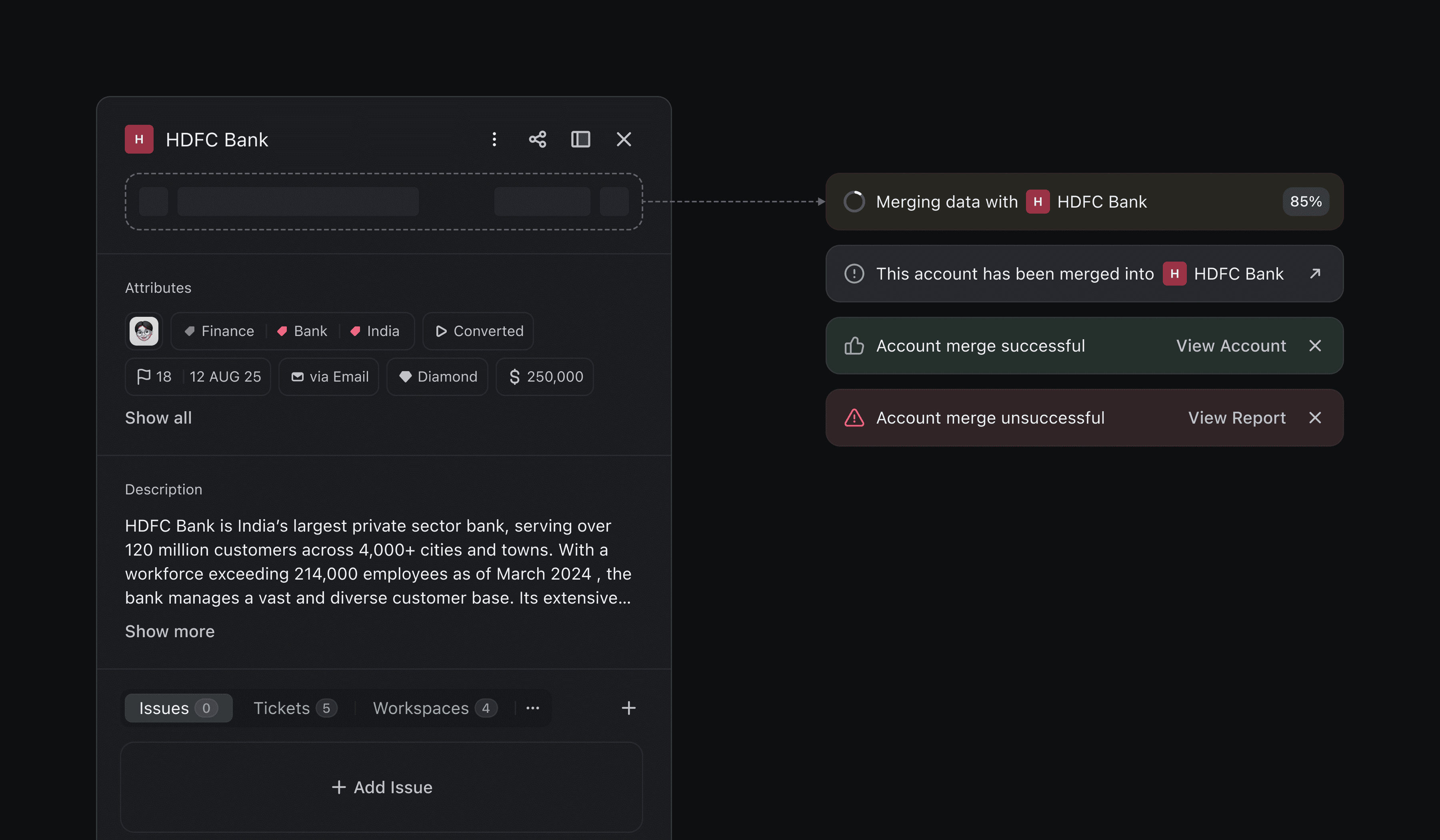
Visibility on Record
To make the deduplication flow transparent, I designed real-time cues directly within individual account records. During an ongoing merge, both records display an activity banner e.g. “Merging data with Account…" so it’s clear something’s in motion.
After a merge, the post-state is reflected right away:
If successful: A “Merge Successful” message appears with a “View Account” CTA.
If unsuccessful: A “Merge Unsuccessful” message is shown with a CTA to review the issue.
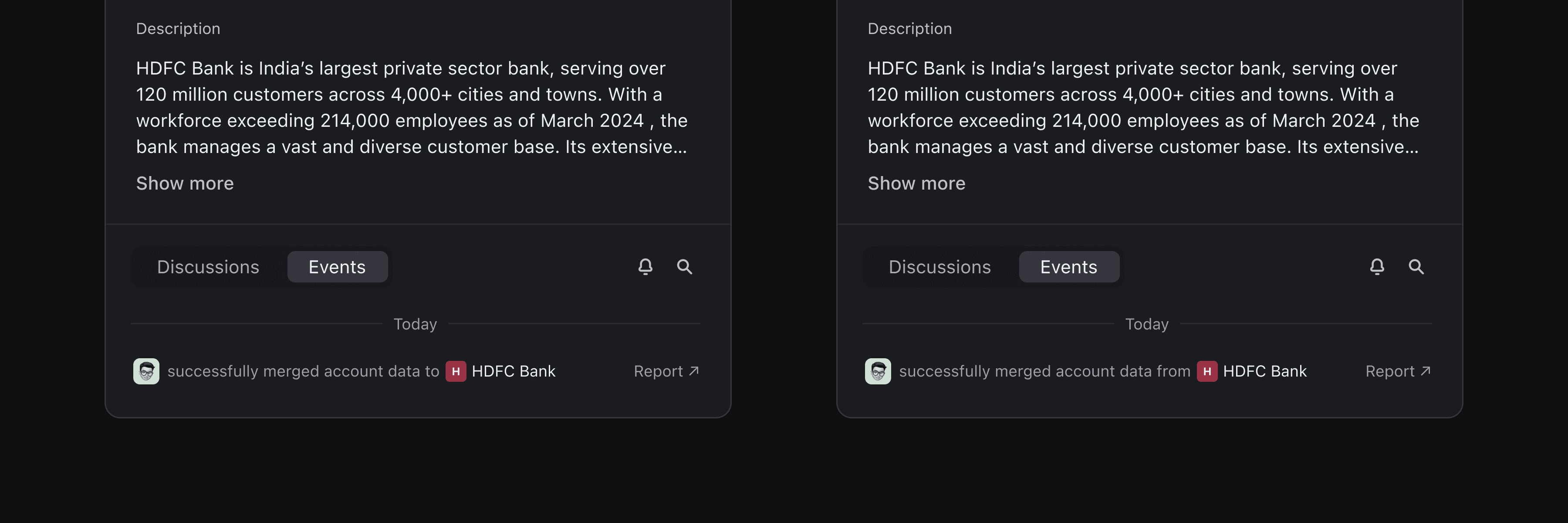
On the secondary record, a persistent banner indicates that this account has been merged into another, with a CTA to navigate to the primary record.
On the primary record, the merge event is logged in the timeline.
Other Considerations
A few behind-the-scenes choices helped smooth out the user experience:
Incremental Loading: To avoid overwhelming users (and the UI), we load 20 duplicate pairs at a time, keeping things fast and digestible.
Hidden Pair Visibility: Sometimes the filters result in an empty-looking list, even when duplicates exist. To avoid confusion, I added a visible prompt when results are hidden due to active filters.
Edge case
Users might delete an account in Focus View, especially if it’s empty or no longer relevant. When that happens, any associated duplicate pair becomes invalid.
When that happens, the system needs a backup plan so I added a fallback that keeps things moving:
A toast pops up saying: “Duplicates resolved! Showing next pair.”
The system then auto-advances to the next pair, maintaining flow without confusion.

Conclusion
What started as a small UX fix, resolving account duplicates, quickly unfolded into a high-impact workflow centred on clarity and control.
Every layer of the experience: from AI-powered highlights to irreversible merge cues was designed to feel purposeful and human.
In just half a sprint, we built a system that respects complexity while delivering simplicity: one that scales, adapts, and, most importantly, earns the user’s trust.
Big thanks to Ananya and Manohar for their support in helping me understand the full context, technical constraints, and customer pain points.