
Team
Raj Panchal (PD)
Priyanka Pal (PM)
Priyadarshan R. (SD)
Satyam Jha (SD)
Diwyanshu K. (SD)
Duration
2 Design Sprints,
Q1 2025
Product
Platform
Legend
Platform: Features that work globally across all apps: like filters, views etc.
Card: A compact snapshot of a record, showing key info like title and status.
Column: A group of cards based on a shared attribute, like stage or priority.
Board View: A kanban-style layout to organise and prioritise work items.
Vista: A customisable canvas that shows you everything that’s going on.
Record: A single piece of information, like a task, ticket, or customer note.
Attributes: The details inside a record: like status, owner, or priority.
Turing: An AI assistant that helps you search, understand, and take action.
Purple (Turing AI Colour): Highlights where AI is working behind the scenes.
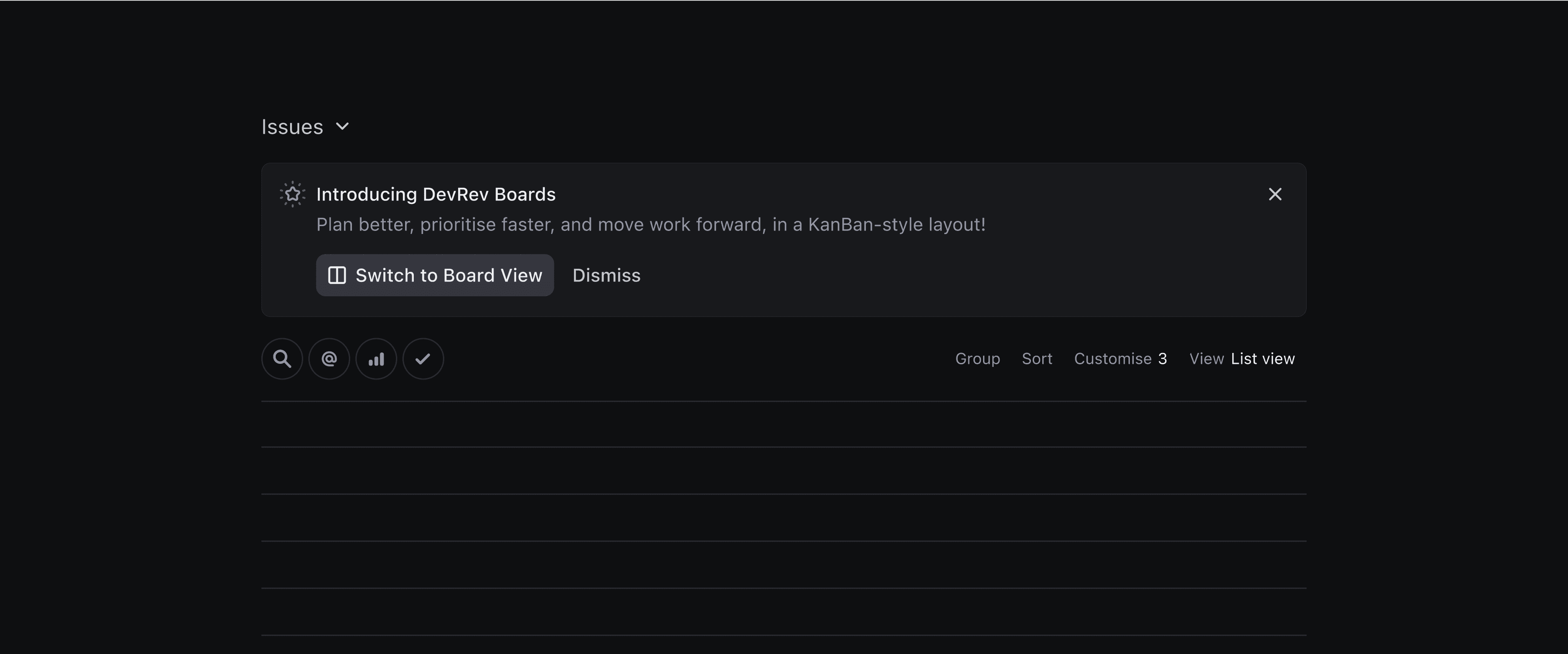
Introduction
In DevRev, users manage complex workflows across objects like Issues, Tickets, and Sprints. While List View offers a dense, tabular overview, it lacks the visual clarity needed for planning, prioritising, and tracking work across stages.
That’s where Board View comes in, a drag-and-drop interface designed to make structured workflows feel intuitive and flexible. But building a kanban-style board that scales across DevRev’s powerful yet complex object model and a customisation layer posed unique challenges. From managing visibility and clutter to supporting intelligent behaviours powered by AI, every detail had to balance capability with simplicity.
Board View wasn’t just about visualising tasks, it was about building a system that adapts to users’ mental models while respecting the complexity of DevRev’s data layer.
Challenges
Through user feedbacks and competitive analysis, I studied how users interact with kanban boards. I identified several key challenges.
How might we show all relevant details, without overwhelming the user?
How might we support customisation without overcomplicating the UI?
How might we balance grouping with performance?
How might we assist users when prioritisation feels unclear?
How might we handle edge cases and platform constraints?
This project highlights the key features. But there’s more behind the scenes: iterations, design thinking, and decisions that shaped the journey.
Book a call for a deeper walkthrough.
Solution
I designed DevRev’s Board View to feel light, focused, and responsive, whether you’re planning a sprint or simply catching up on your work.
The layout features compact, customisable cards with a clear visual hierarchy, making it easy to scan, compare, and act. Users can tailor what attributes appear on cards and control their order. Column and board-level controls were thoughtfully placed—to maintain a clean interface.
Features like Quick Controls, Bulk Editing, and Skim Mode make the board adaptable without adding friction. I also designed clever defaults: like column load limits and attribute caps: to keep things snappy, and added fallbacks for edge cases.
AI features like Smart Sorting, Smart Clusters and Smart Prioritise assist when prioritisation gets tricky, surfacing intelligent suggestions while still giving users full control. And every interaction, from drag-and-drop to column reordering has been carefully designed to feel quick and intuitive.
The Nudge
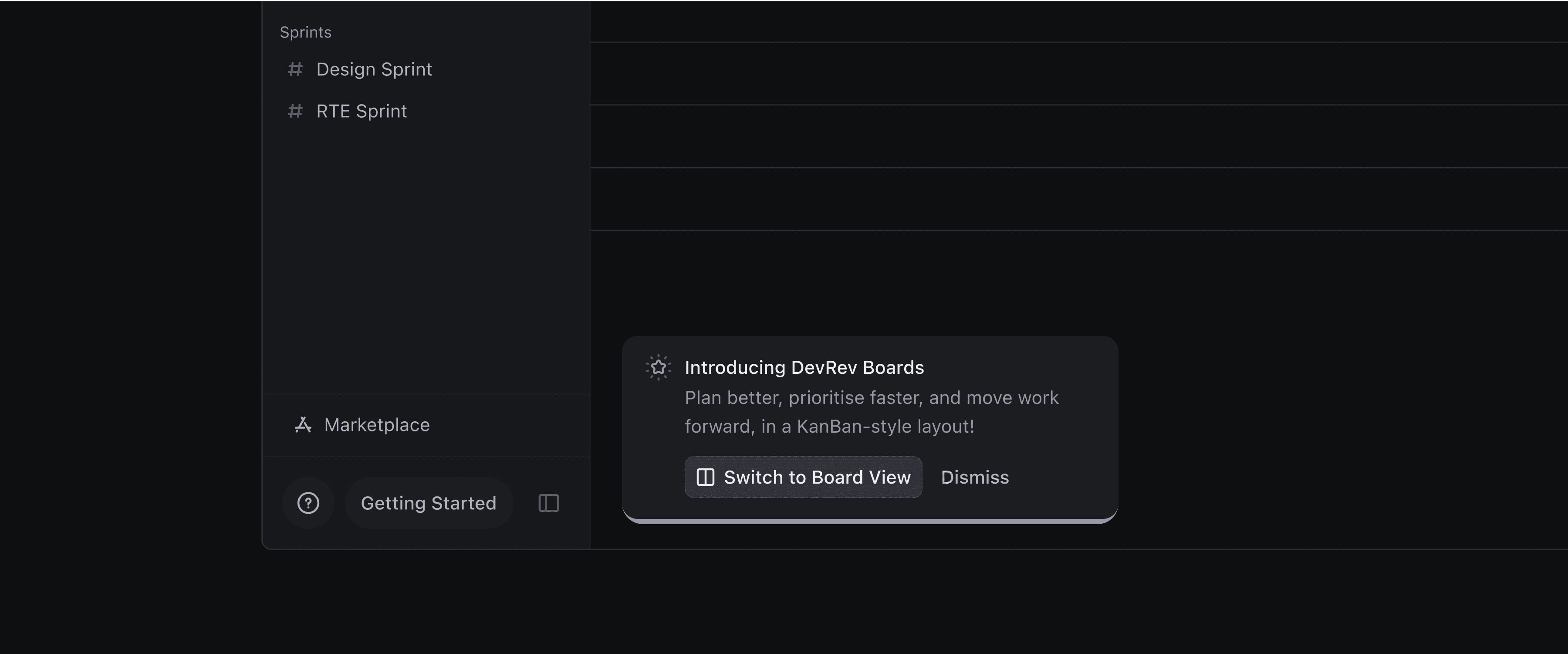
To introduce the new Board View without overwhelming users, I designed a series of gentle, well-placed nudges across the interface.
A suggestion banner in vista gives the feature the right level of visibility, highlighting what’s new without pulling users away from their work.
For a lighter nudge, a corner toast serves a similar purpose.
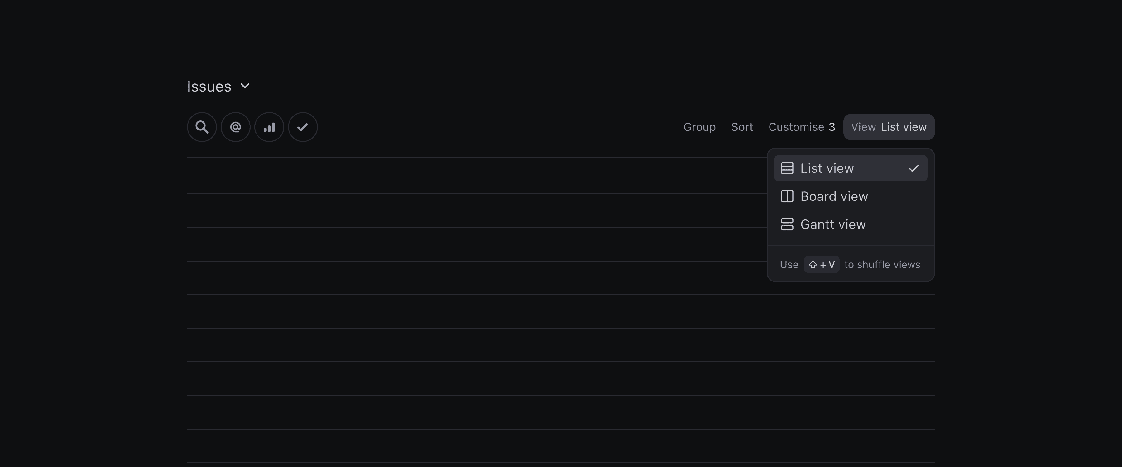
To give users manual control, I added a toggle within view controls, letting them switch between views on-demand.
And for the power users, I introduced a shortcut Shift + V which makes jumping between views quick and seamless.
Card Height
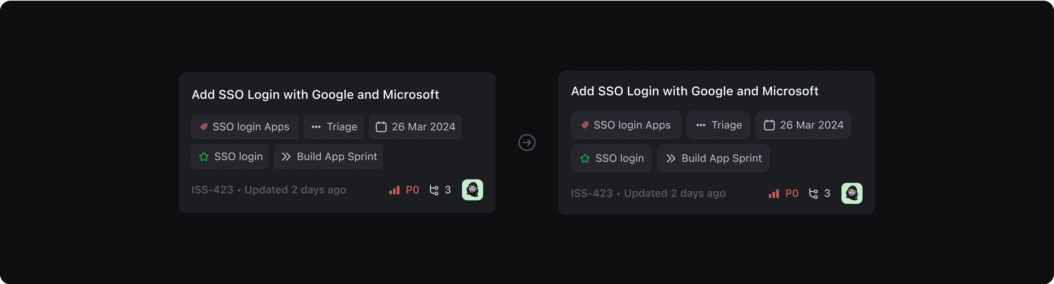
One of the first things I noticed (confirmed by internal feedback) was how little information most kanban boards reveal at a glance. The issue wasn’t the data; it was the card height. When cards stack into vertical columns, even a few extra pixels can drastically limit visibility.
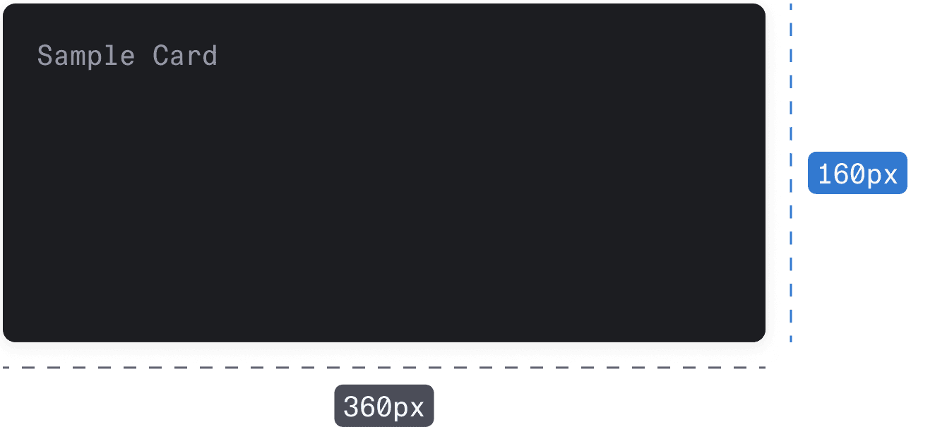
The goal was to show more cards per column without making them feel cramped. Through careful iteration, I designed a layout that strikes the right balance: minimal height, clear hierarchy, and just enough breathing space for the content to feel readable. I also designed a feature to allow users to see more information at a glance, which we’ll explore later in this project.
Card Sections
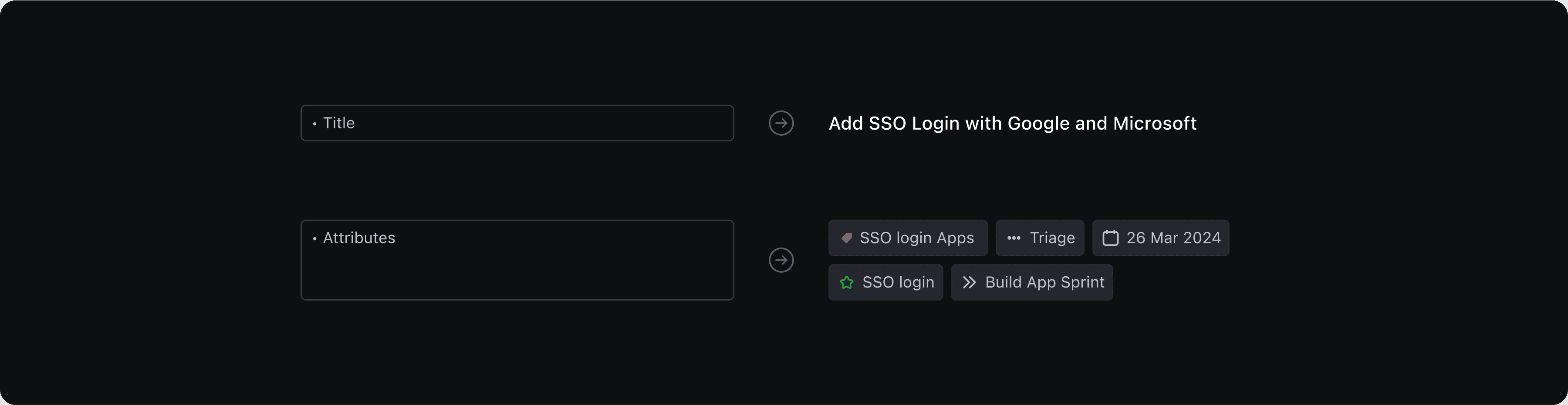
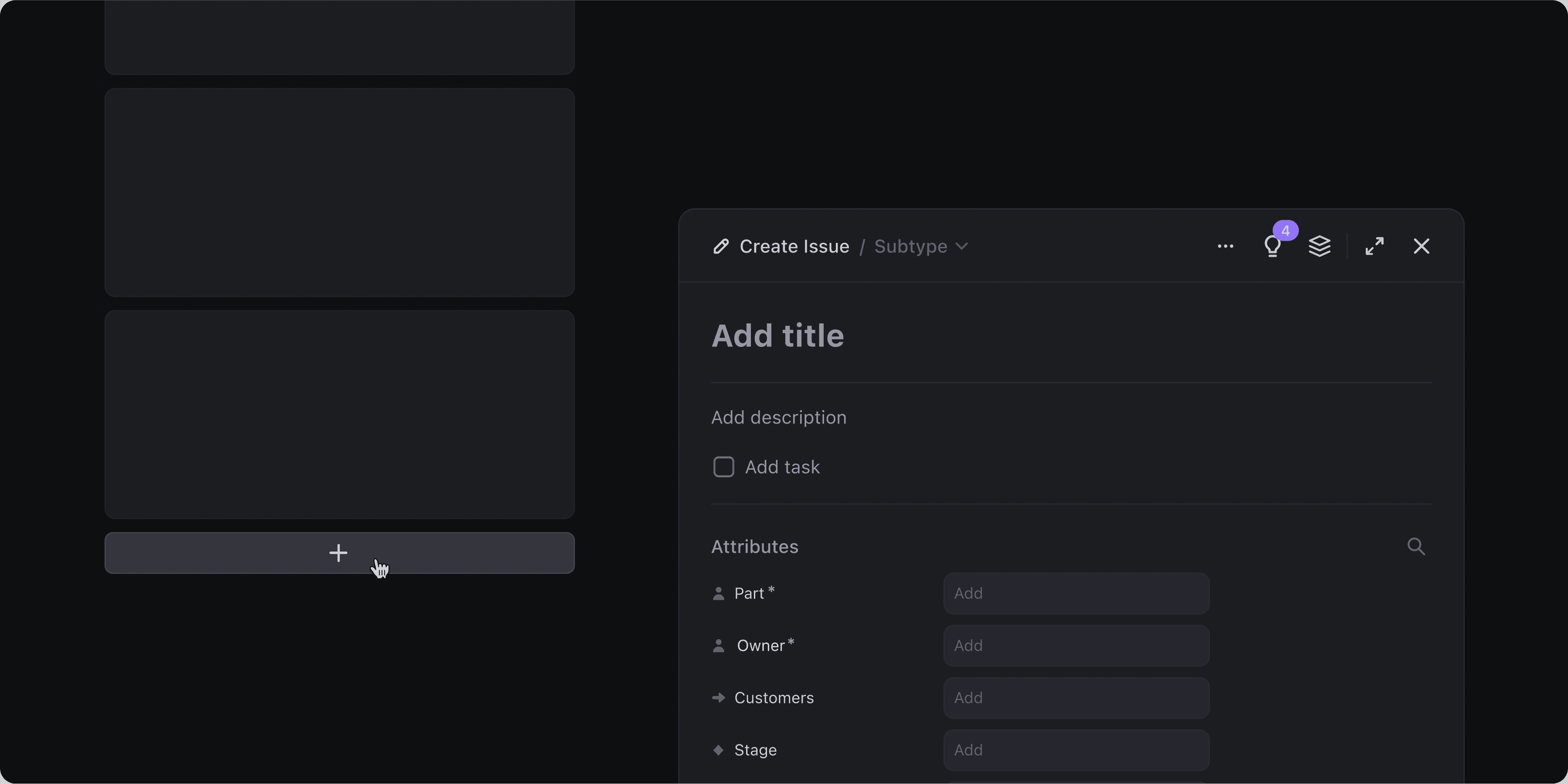
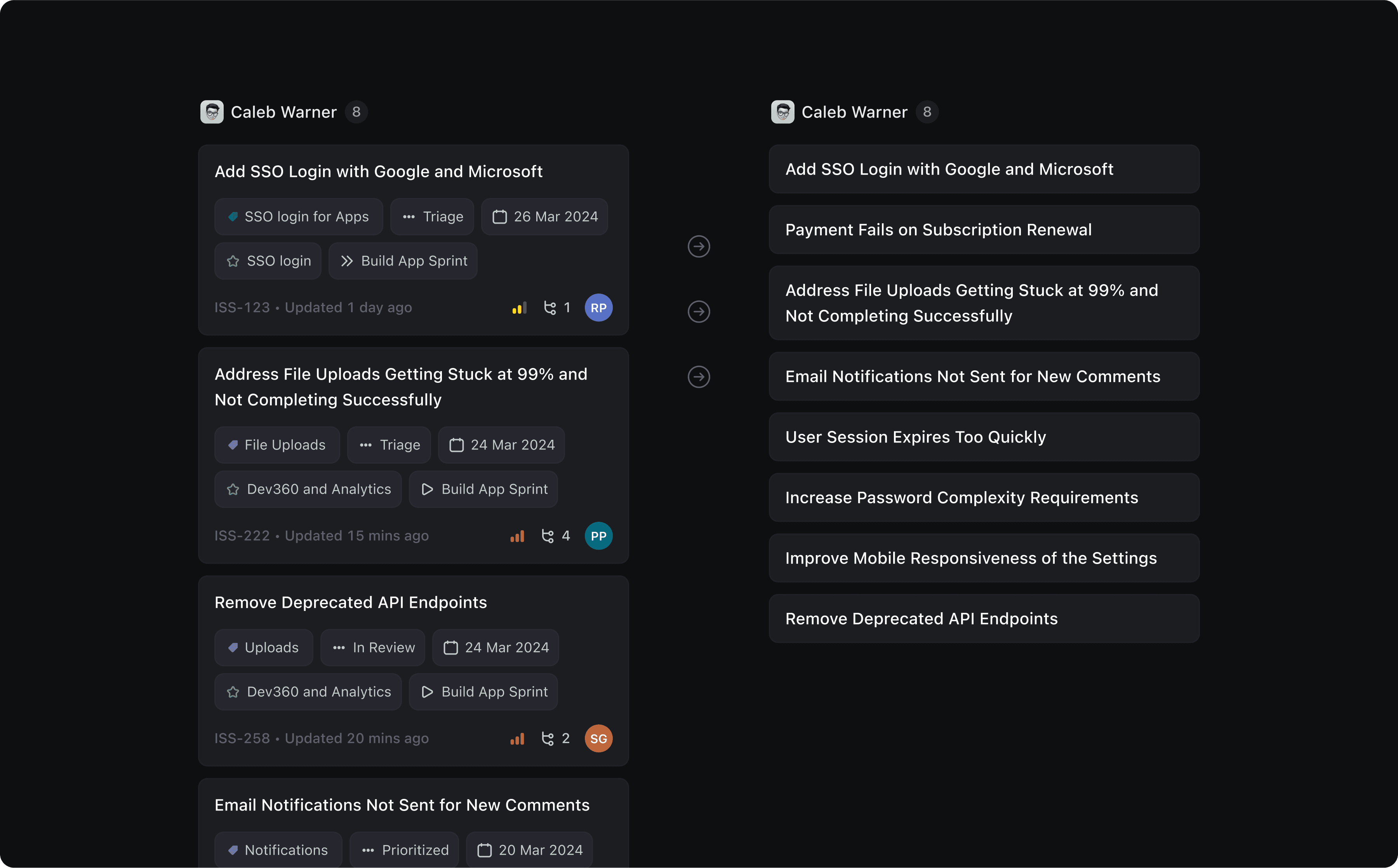
A kanban board is only as useful as the information each card can convey at a glance. So I designed the card layout, carefully structuring each section to surface the right details.
Card Structure
When someone looks at a card, the first few seconds matter. The layout has to guide their eyes, surfacing the most important information before anything else.
Title stands out as the visual anchor. It’s deliberately more prominent than the rest, optimised for quick scanning and built to handle edge cases like unusually long titles.
Attributes stack neatly and wrap across multiple lines if needed. This ensures that users always see desired information.
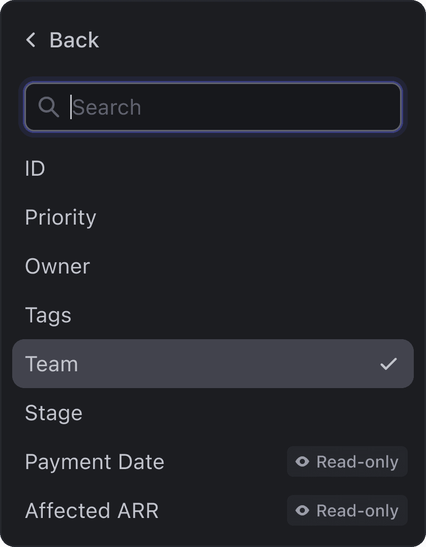
By default, the attributes shown are pulled from the summary settings, similar to what users see in List View. For deeper personalisation, these can also be fine-tuned via the Customise menu on Board View, which we’ll explore shortly.

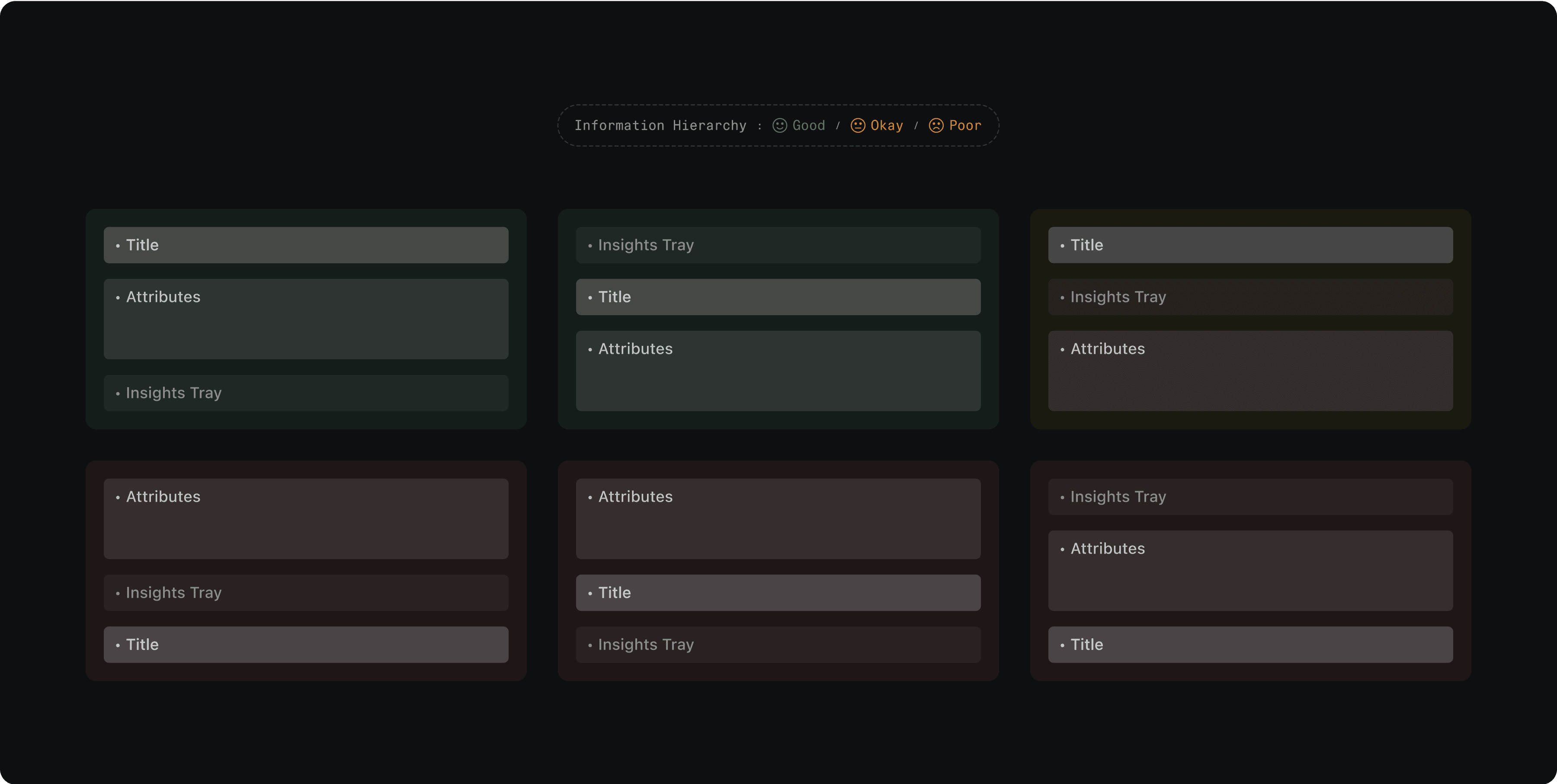
I explored different layout hierarchies to understand how users visually process this information. Through that, I identified card structures that balance readability, density, and visual hierarchy, making sure what needs attention gets it, without overwhelming the rest.
Insights Tray
DevRev supports multiple apps, each with its own object types like Issues, Tickets, Opportunities and more. That meant the card layout couldn’t be one-size-fits-all.
To solve for this, I designed the Insights Tray to be dynamic, adapting its content based on the type of object shown on the board. Regardless of the object, the tray starts with a consistent foundation: the object ID and last updated time
After that, the tray shows key attributes relevant to that object. For example, Issues might surface priority and owner, while Tickets highlight SLA breach time and ownership. This dynamic design ensures that users always see what’s most relevant.
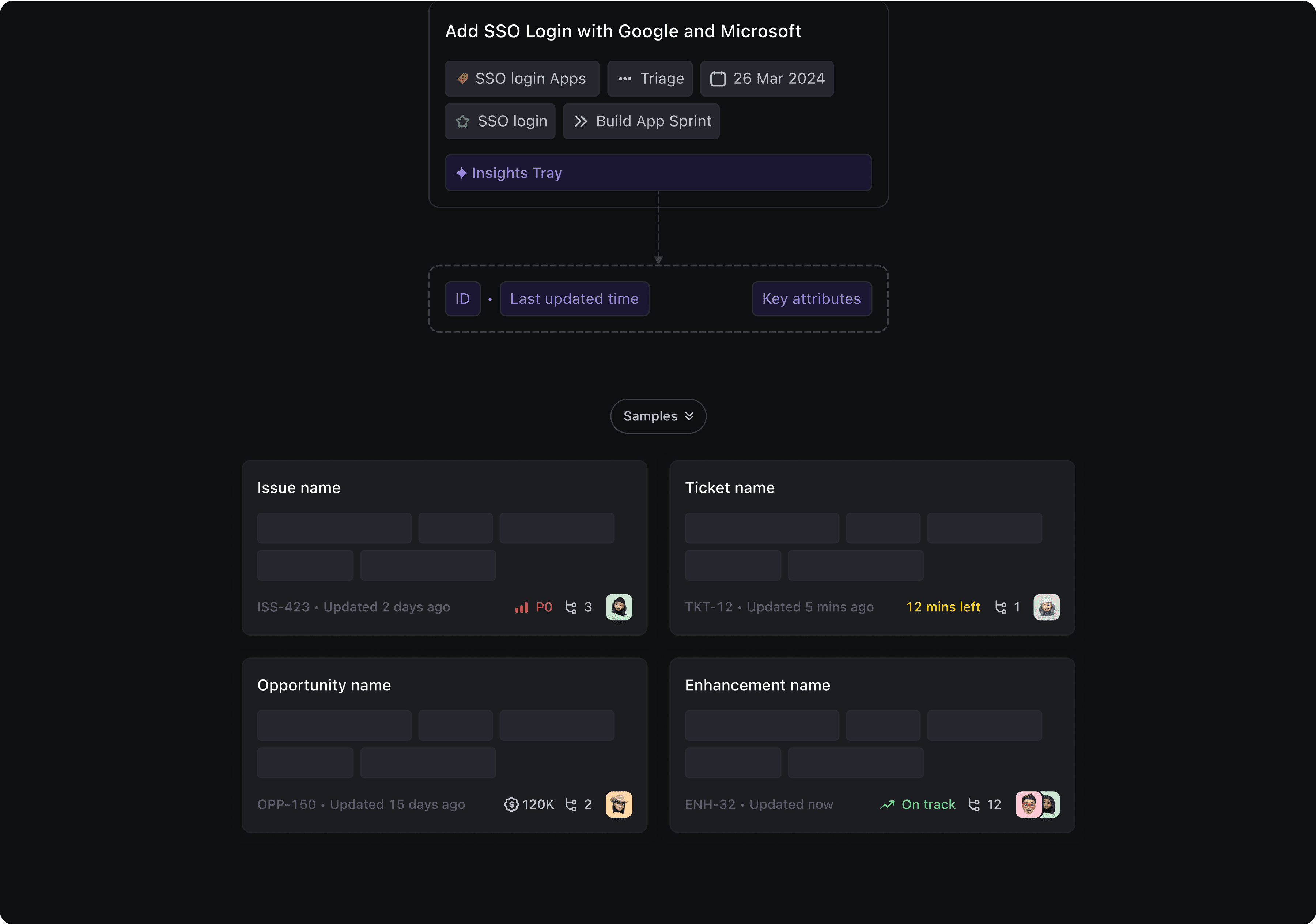
With DevRev’s flexible object model and the ability to create custom links between objects, dependencies become a critical part of understanding any piece of work.
That’s why showing them directly on the card is essential. Each card surfaces dependencies and their types, giving users a quick sense of what this item is blocked by, related to, or driving forward.
I also decided to bring in key attributes, similar to what’s shown in the Insights Tray, offering a compact yet rich view of dependencies, without leaving the board.

Refining the Card
After finalising the structure of the card, I started making various iterations to reduce visual clutter and make cards easier to scan. The padding around the attributes was increased to create breathing space. I also slightly increased the corner radius, giving the cards a softer, more modern appearance that aligns with DevRev’s overall design language.
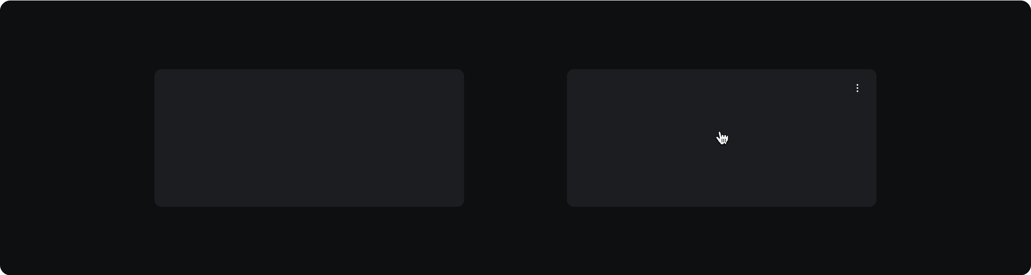
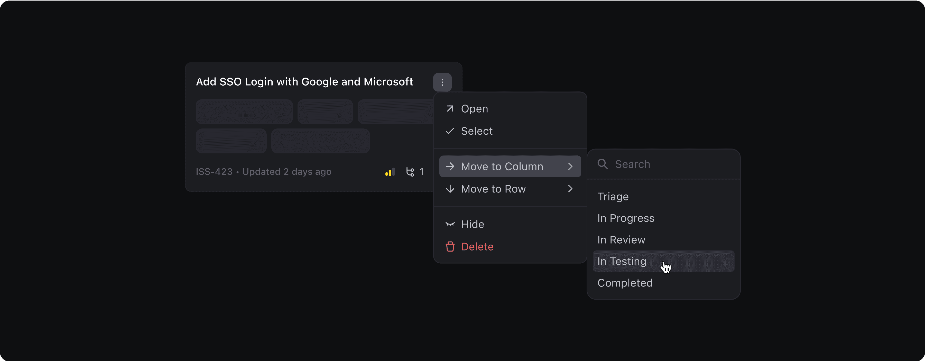
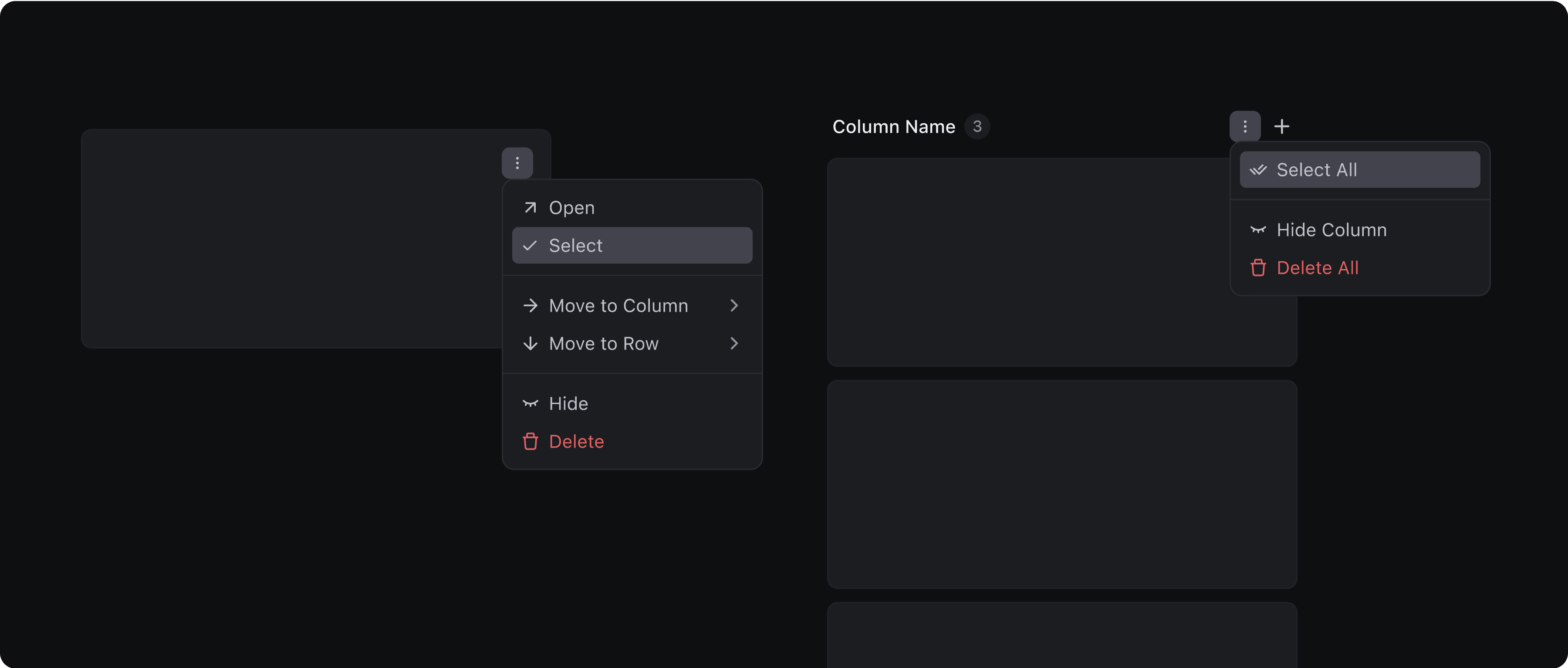
Card Controls
To keep the board clean and focused, card controls are revealed on hover.
This approach keeps the interface light while still offering quick access to essential actions. Users can open the record, select it to enter bulk mode, or move it across columns or rows even if the destination is out of view. They can also hide or delete a card directly from this menu.
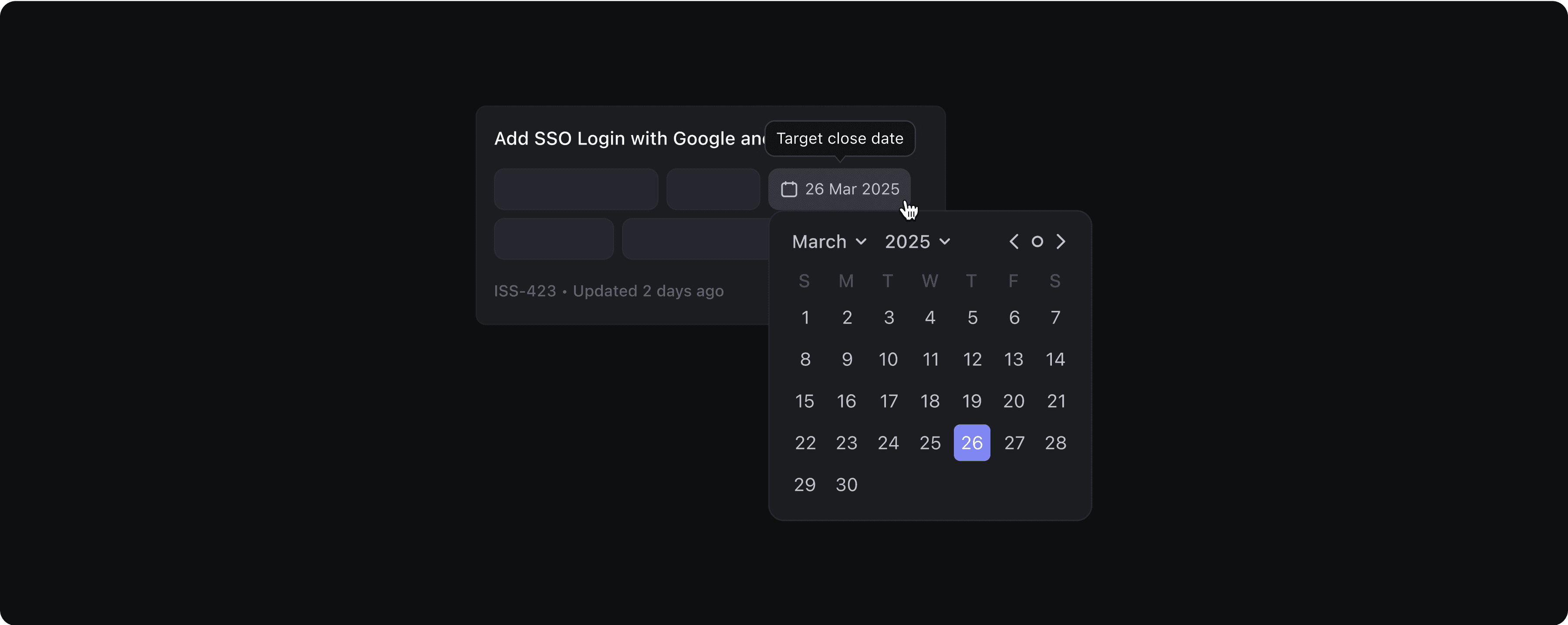
Tooltips & Custom Attributes
DevRev’s flexibility allows teams to create custom attributes tailored to their workflows but with that flexibility comes the risk of misinterpretation.
A date value on a card might mean a Target Close Date, Release Date, or something entirely custom. To prevent confusion, I decided to show tooltips on hover.
To make updates effortless, we also enabled inline editing. Users can tweak fields like owners, dates, or priorities right from the card without opening the record.
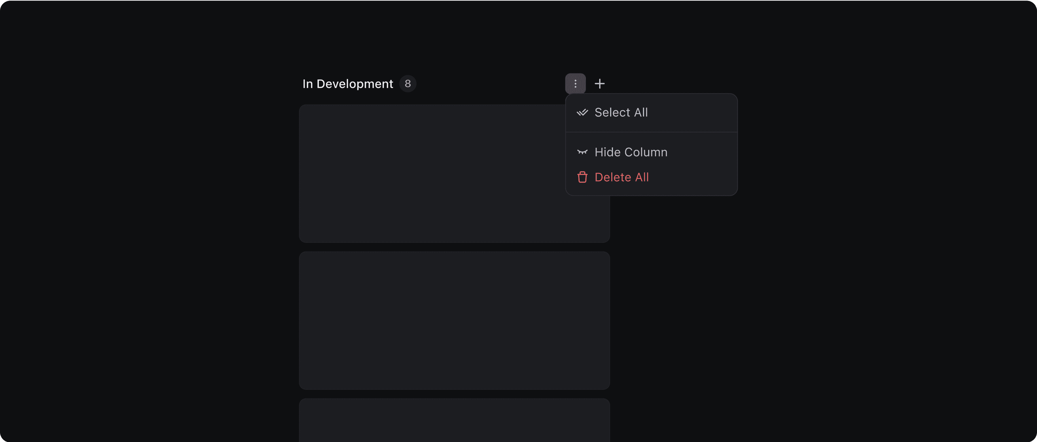
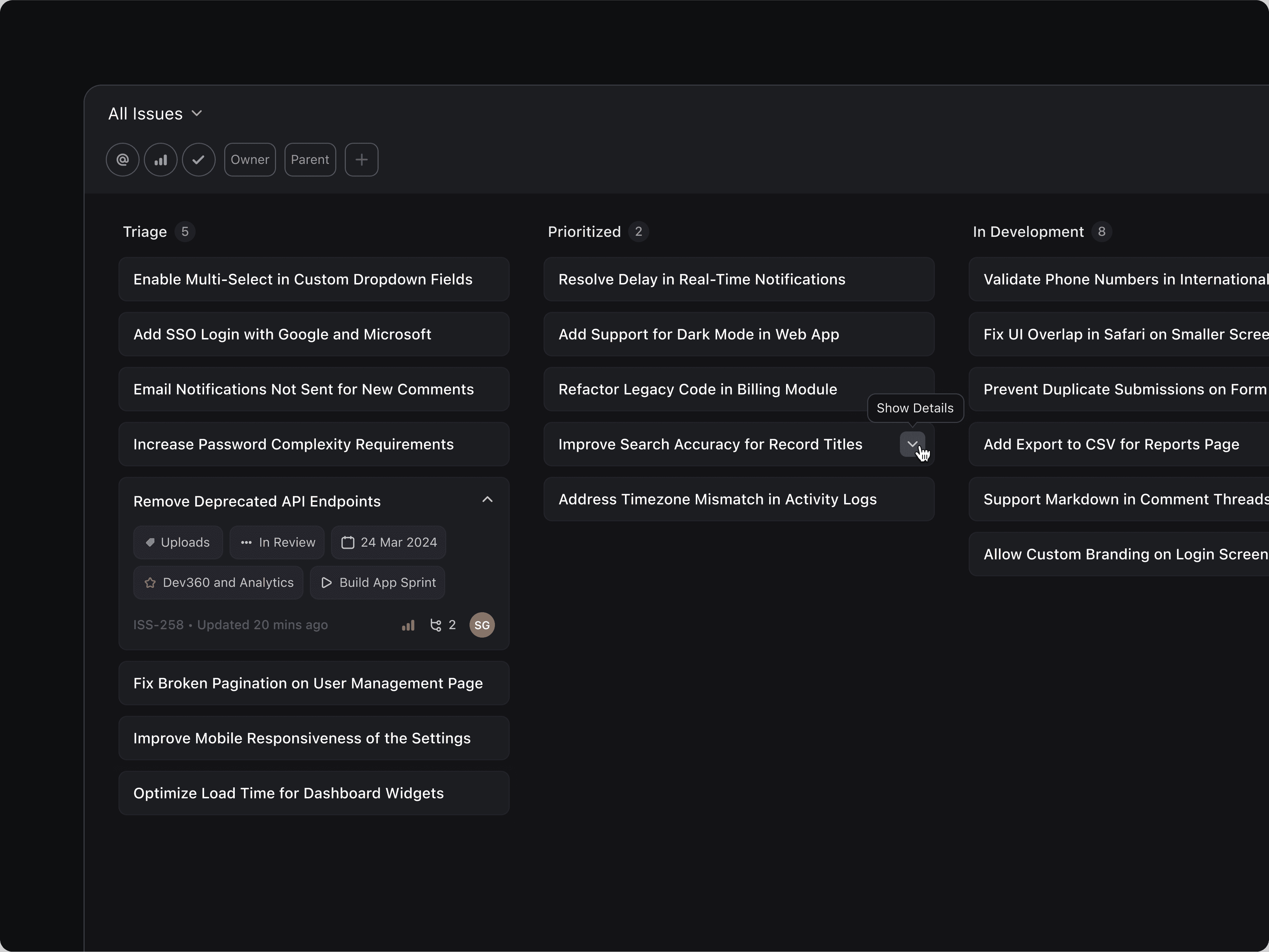
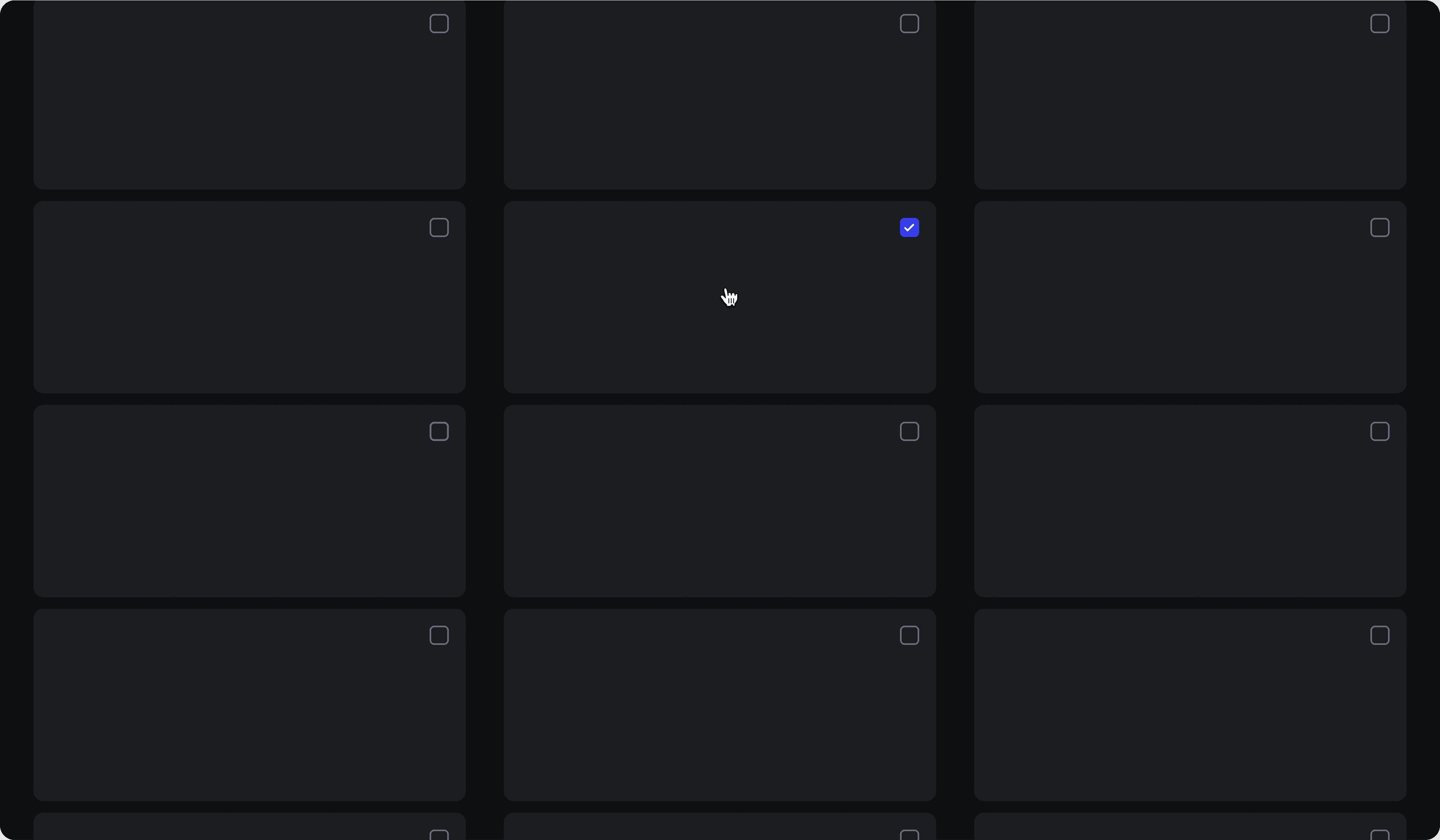
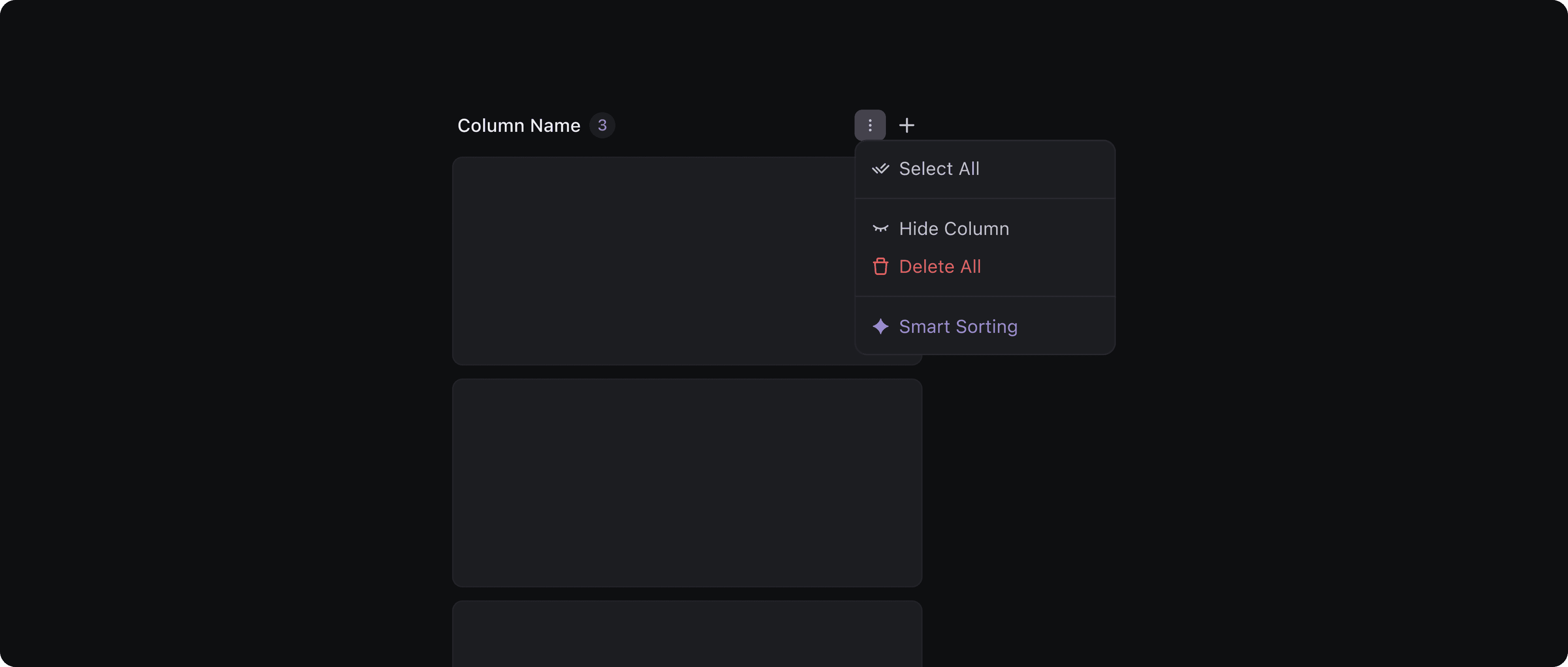
Column Controls
Similar to cards, column controls were designed to appear on hover. By default, each column shows only the essentials: a title and a total item count.
At the top and bottom of each column, a plus button allows users to quickly add a new issue at desired position.
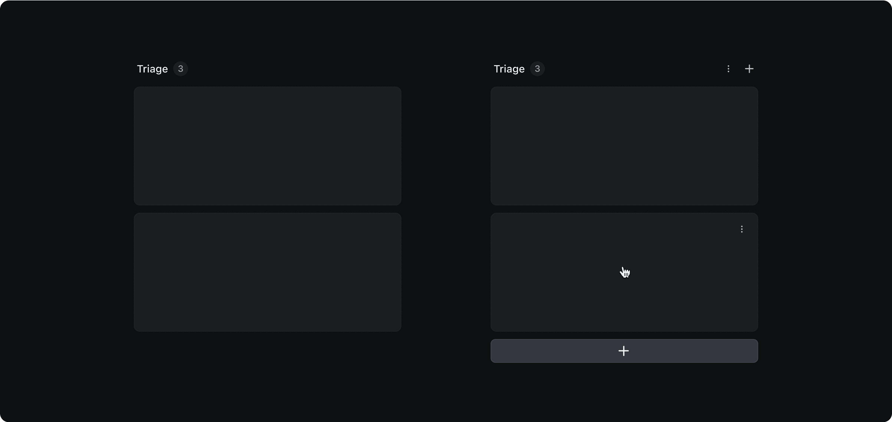
Additional actions are placed in a three-dot menu, including:
Select all: for triggering bulk actions like stage updates or owner changes.
Hide column: to temporarily remove it from view and hide its data.
Delete all: to clear the entire column
Card drag & drop
Drag and drop is one of the most essential interactions in any board view. During competitive analysis, I noticed that many tools still rely on outdated patterns, like thin line indicators to show where a card will be dropped. While that works well in list views, it feels disconnected and imprecise on a visual board.
For DevRev’s board, I designed the drag-and-drop interaction to feel modern and fluid. As users drag a card, the surrounding cards shift dynamically to make room, creating a natural, fluid motion. A shadow placeholder appears in real time giving users immediate visual feedback on exactly where the card will land.
Column Reordering
Users can reorder columns using a grab handle that appears when they hover over the column title. As they drag, the original column stays in place in a disabled state, so the layout doesn’t visually collapse or shift unexpectedly.
A simple line divider indicates where the column will land, making the interaction feel light and easy to control.

The Board
When users switch to Board View from the view menu, they’re greeted with a dedicated loading state.

I paid close attention to padding and spacing, ensuring that each card remains legible and easy to scan.

The Sprint Board follows the same visual and interaction pattern, seamlessly replacing the List of Issues with a board layout.

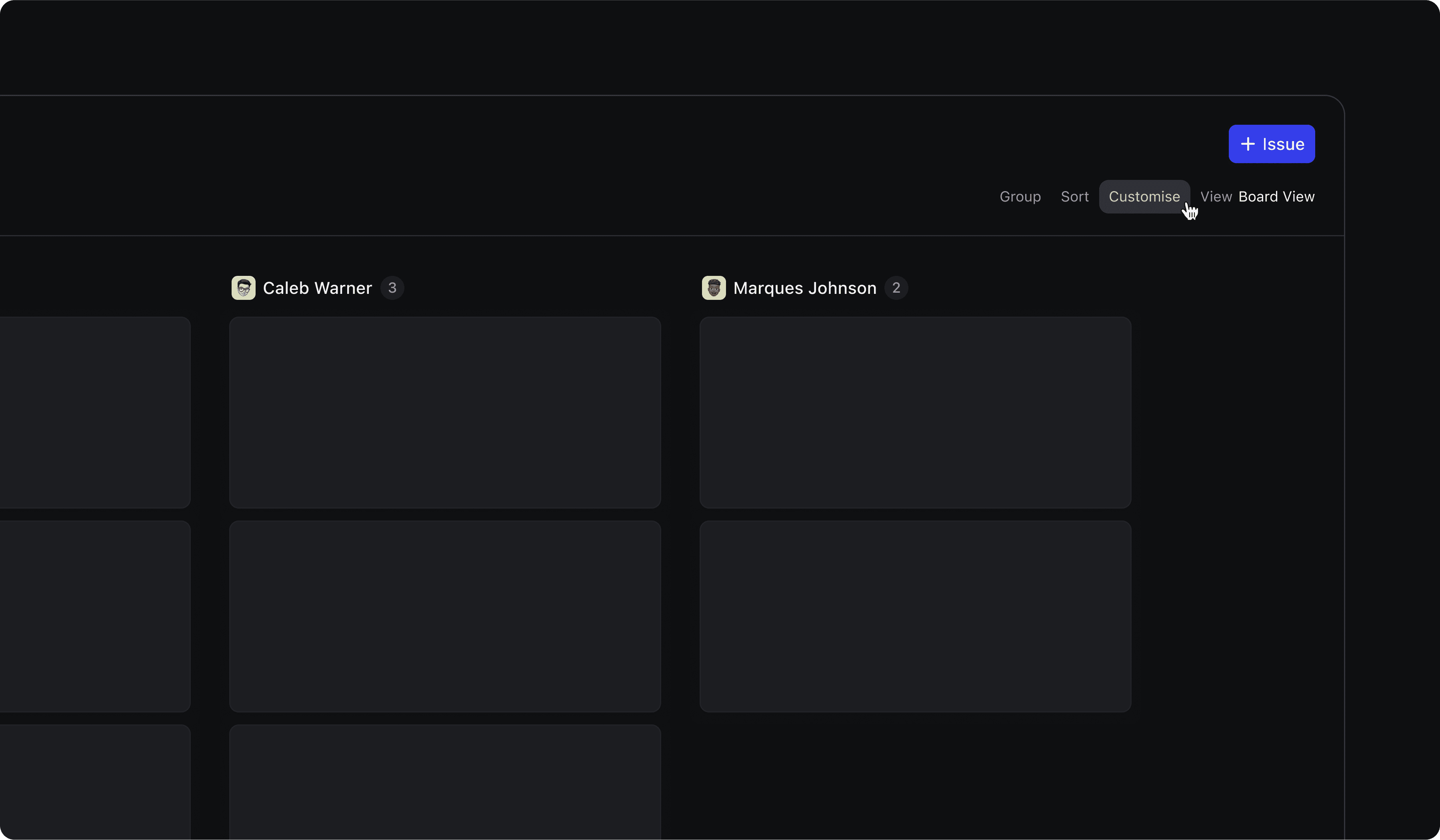
Board Controls
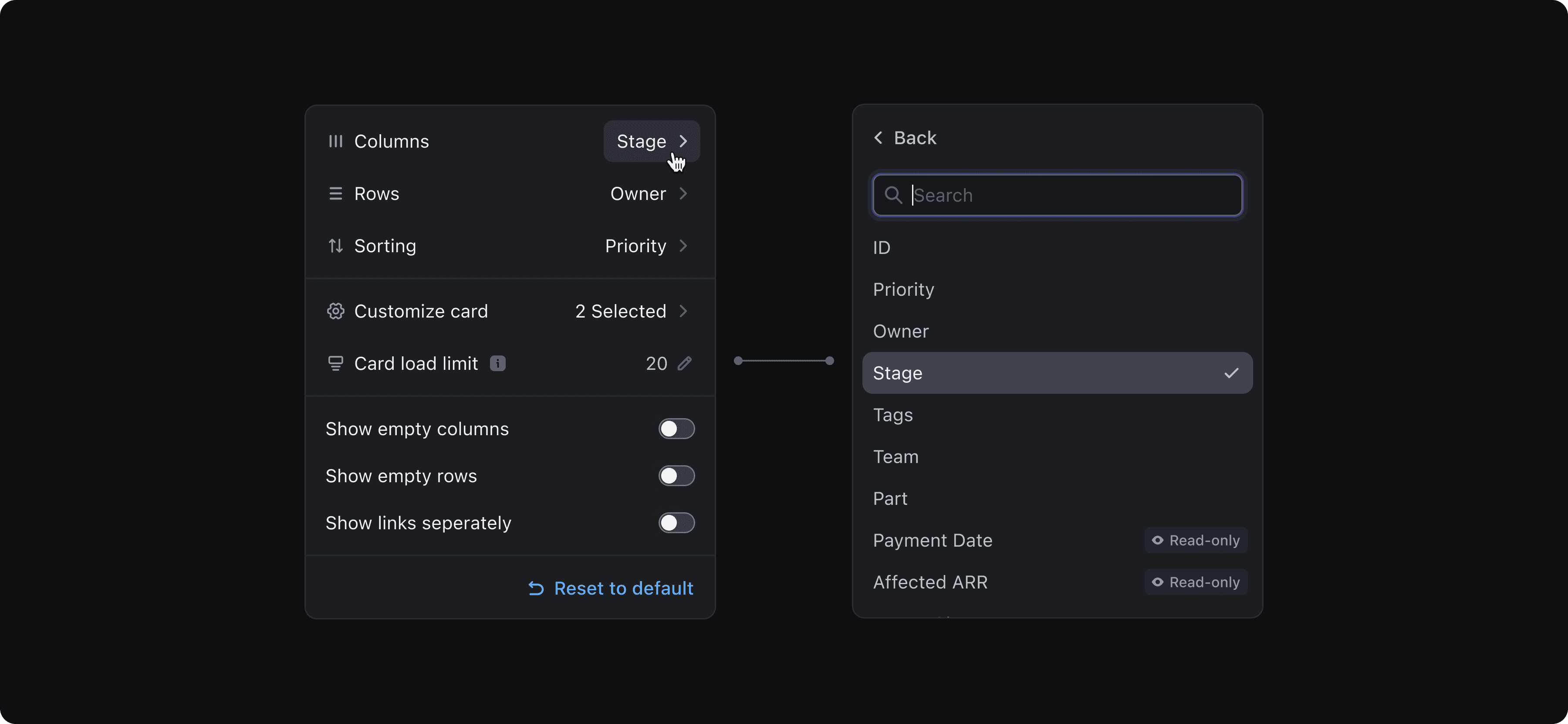
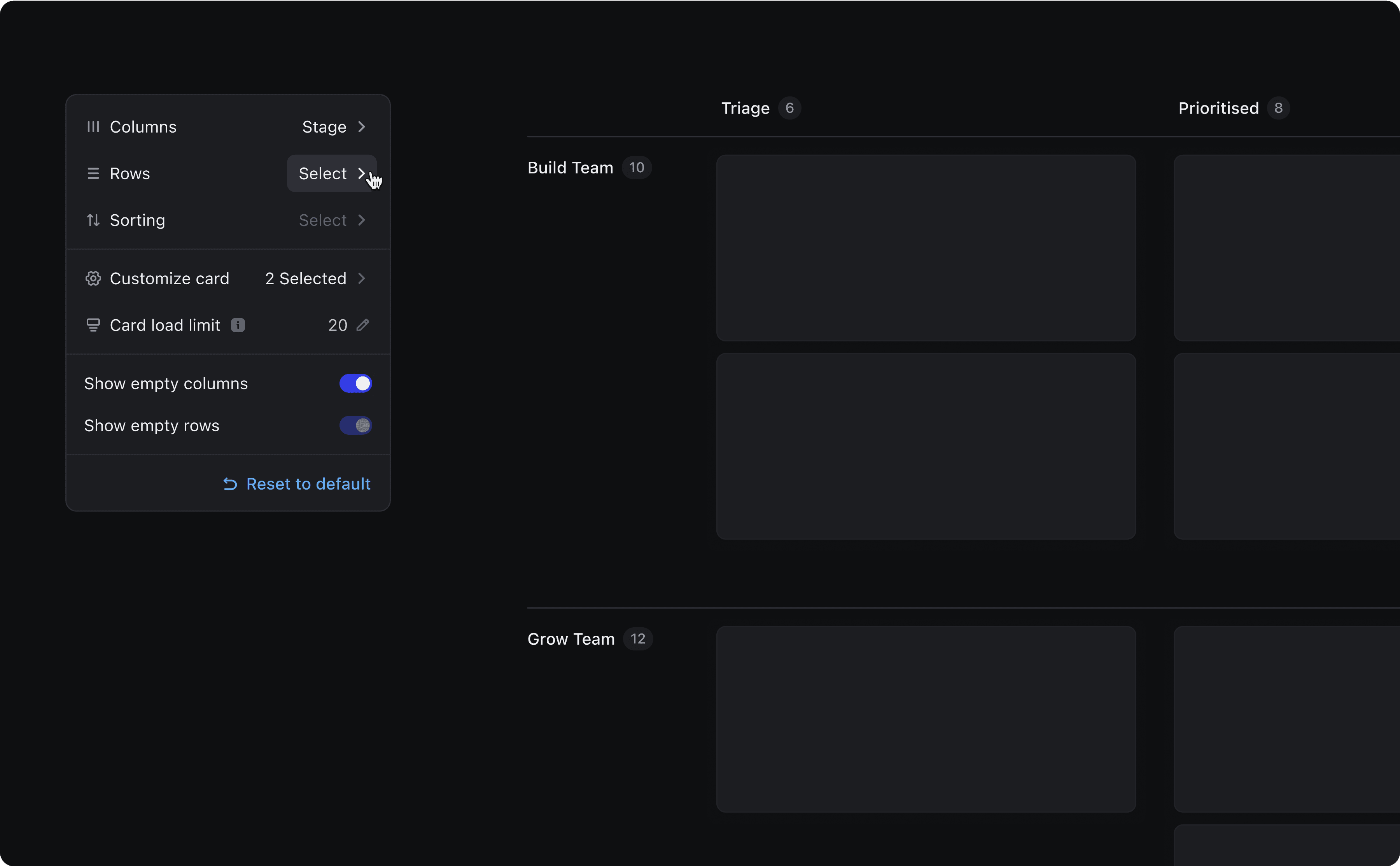
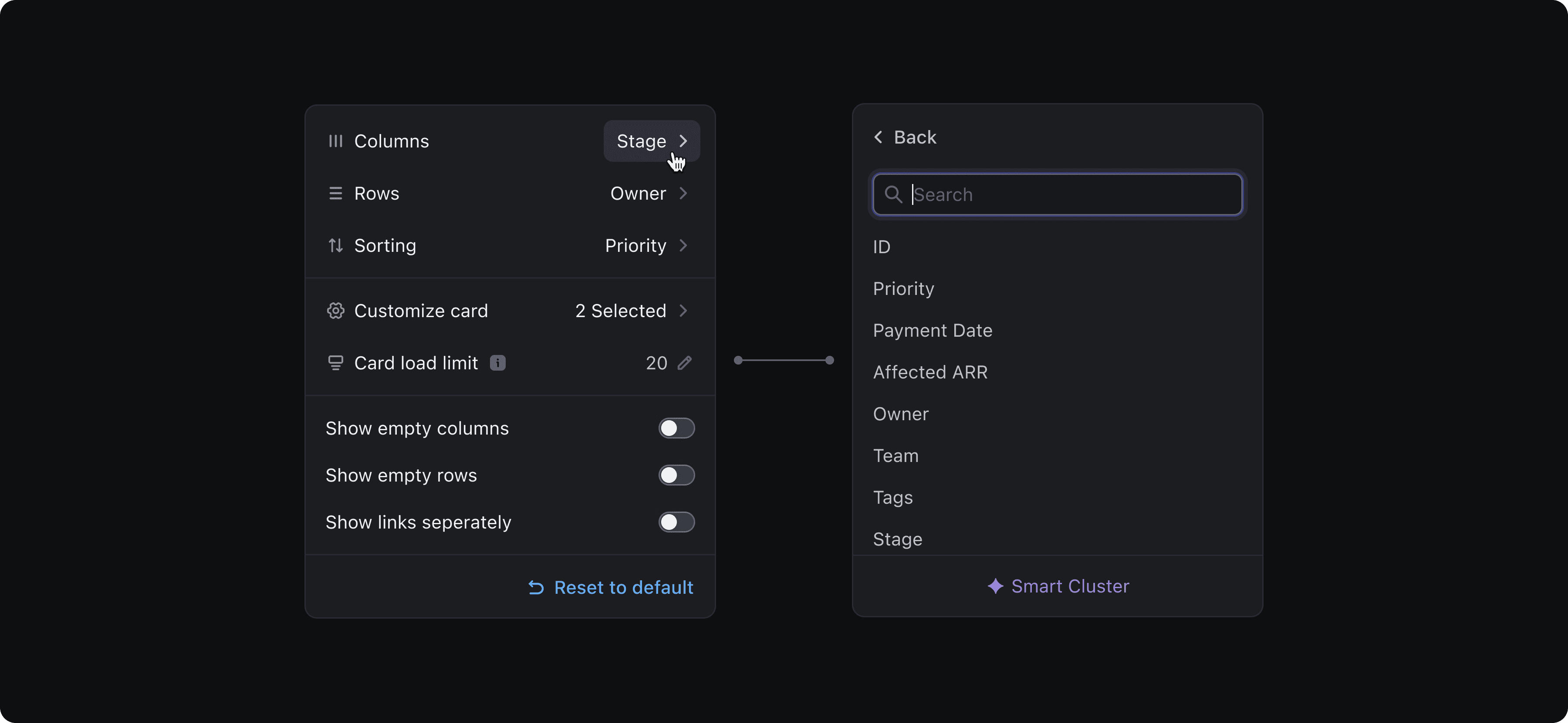
To tailor the board layout to individual workflows, users can access Board Controls via the Customise menu in Vista.
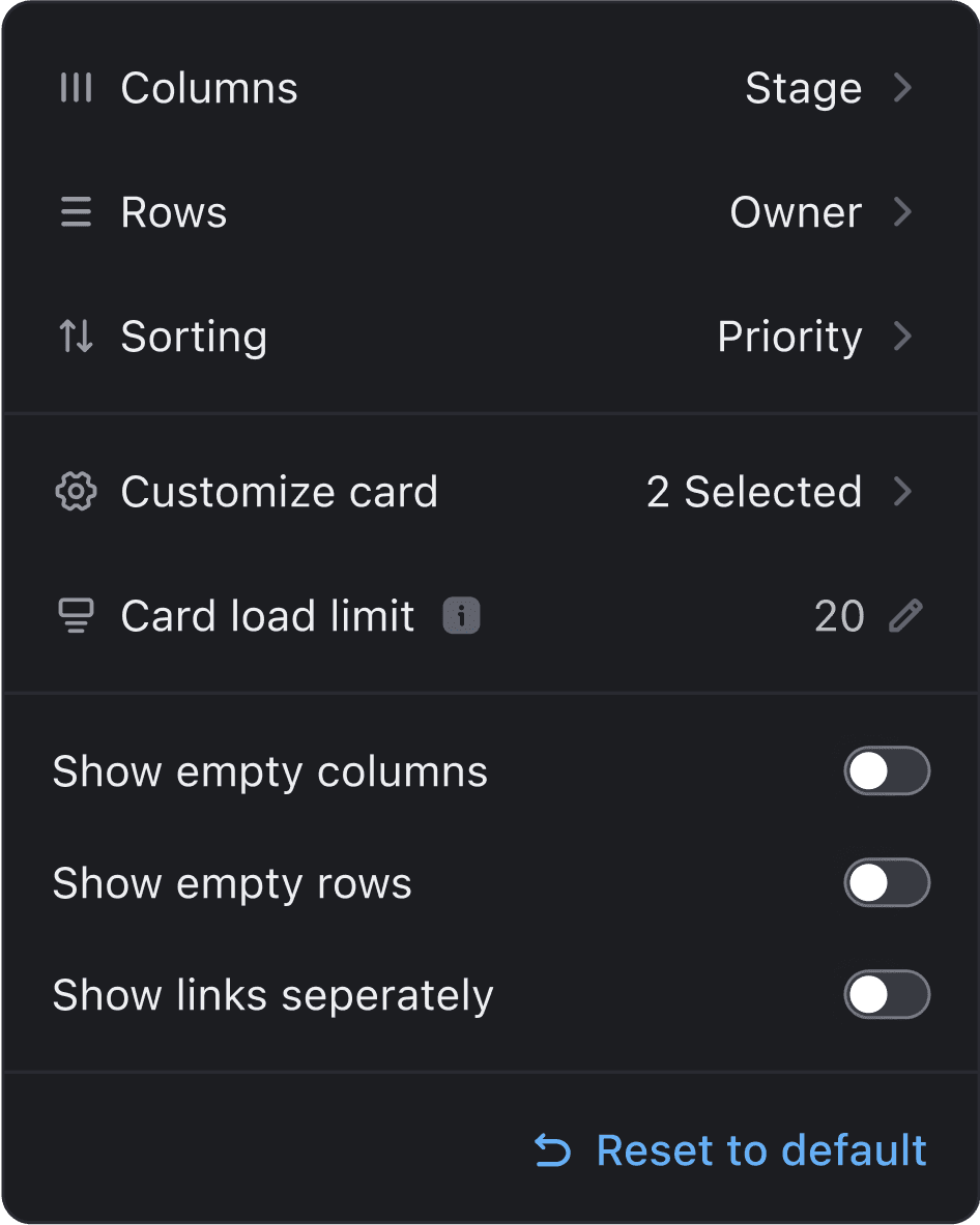
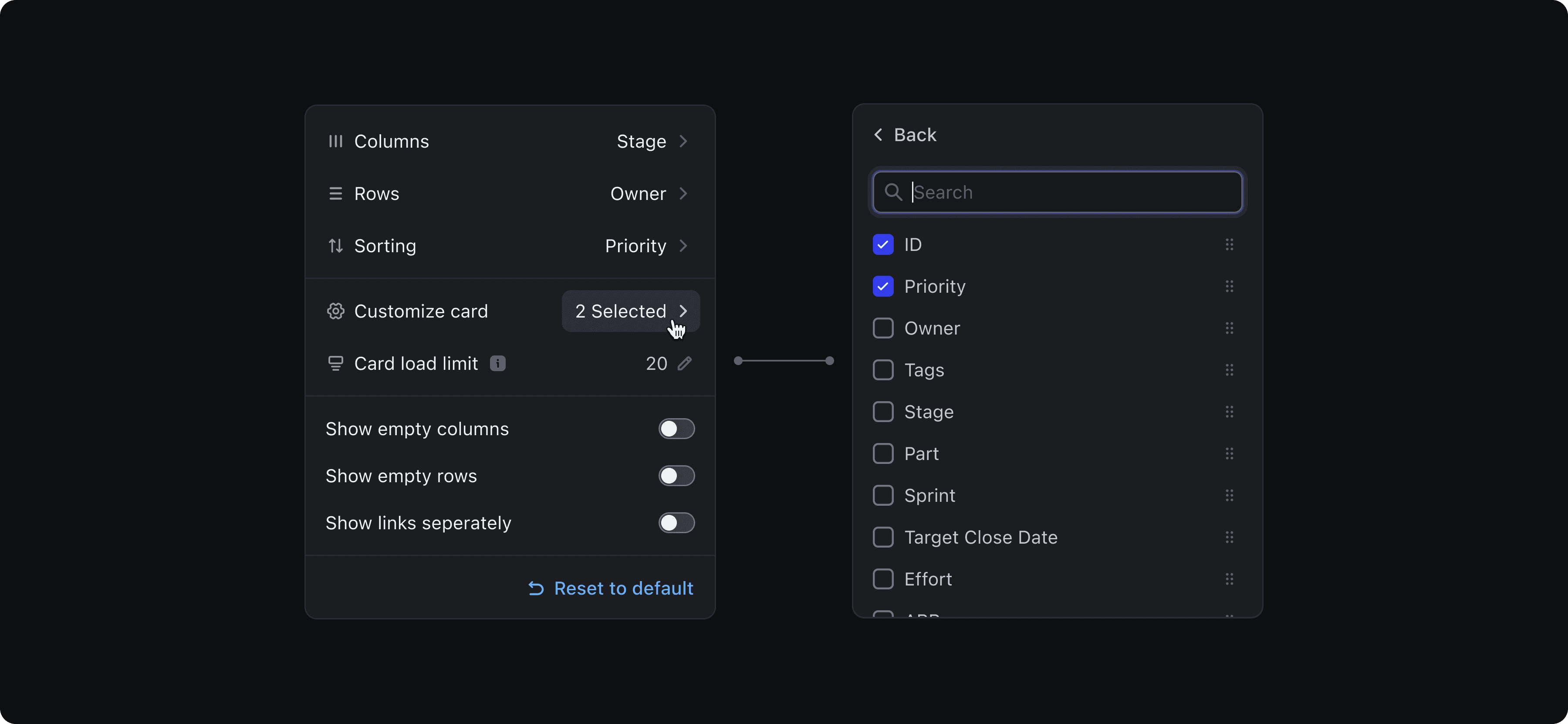
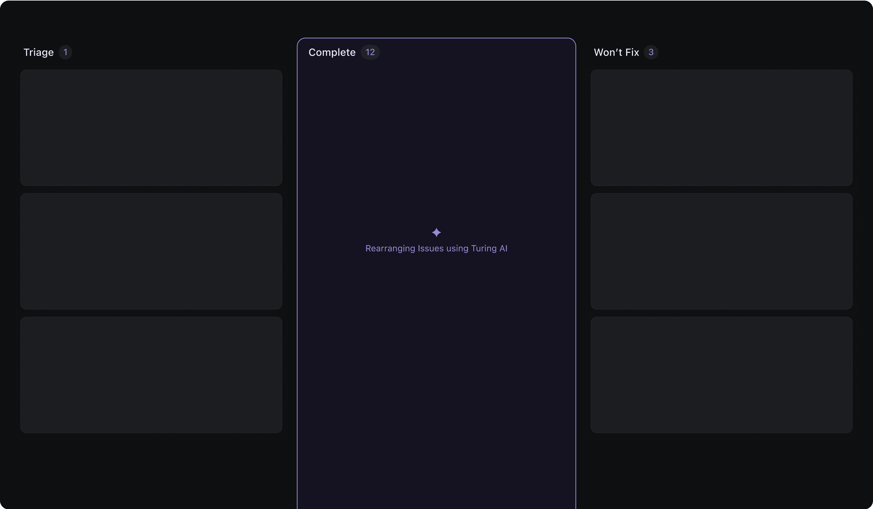
Columns
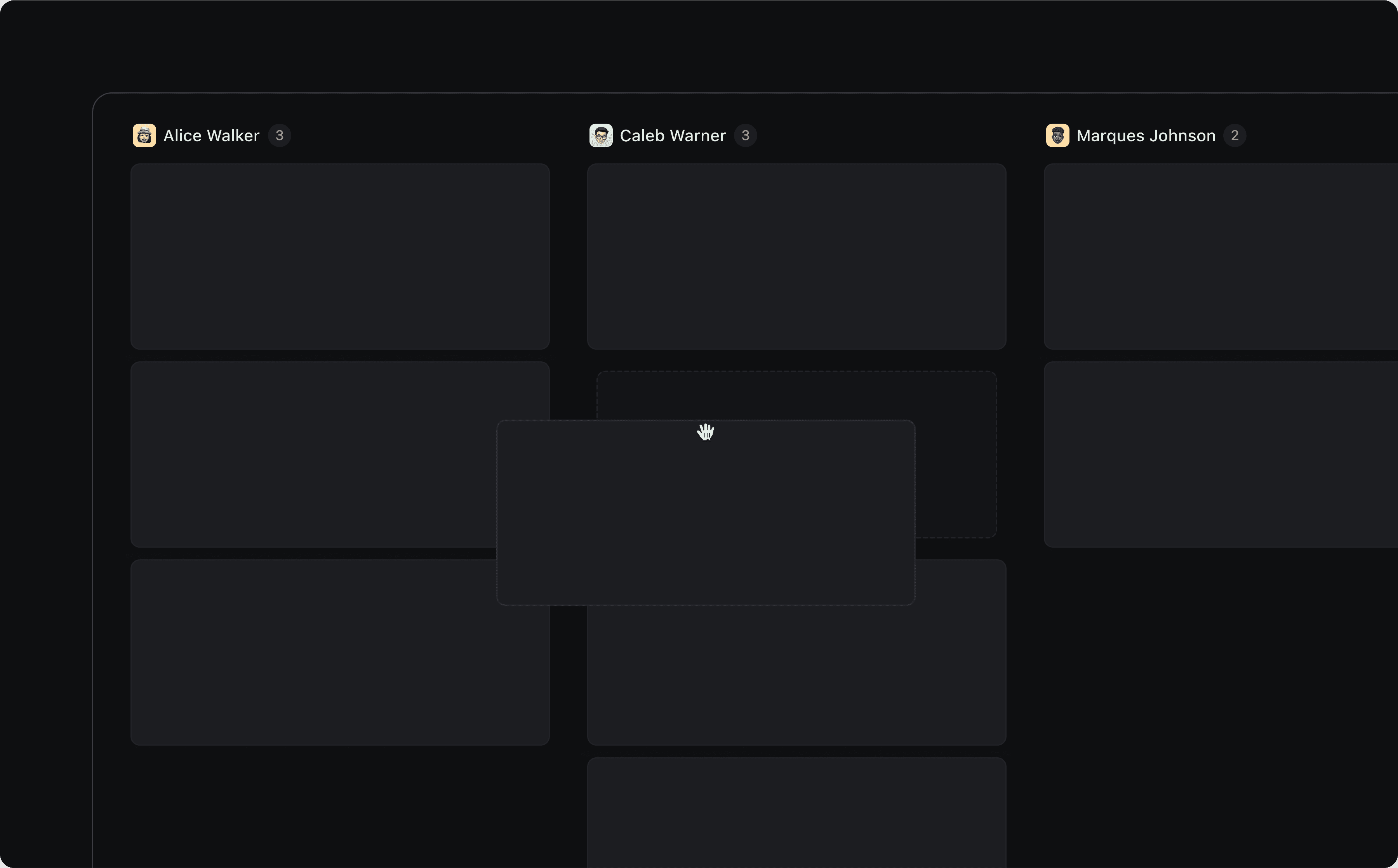
In Board View, columns represent groups of items typically based on an attribute like stage, owner, or priority. By default, cards are grouped by the stage of the object, creating a familiar kanban-style layout. Users can change the grouping attribute anytime, to instantly reorganise the board.
One key consideration: DevRev also supports grouping in List View. So when a user switches from a grouped List View to Board View, we preserve that grouping logic. Creating a seamless, consistent experience across views.
Rows
In theory, rows in a board view represent a second level of grouping, allowing users to organise cards by two attributes instead of one. This can be useful for prioritising work within categories.
Some early customers even requested support for 3, 4, or 5-level grouping. While we saw the value in this, we chose not to introduce multi-attribute grouping in the board view. Instead, we’re exploring this as part of a dedicated Pivot Table experience.
Sorting
Sorting is often the first step users take in Board View. They can quickly sort cards by attributes like priority or created date, apply ascending or descending order, and then fine-tune the layout using manual drag and drop for final prioritisation.
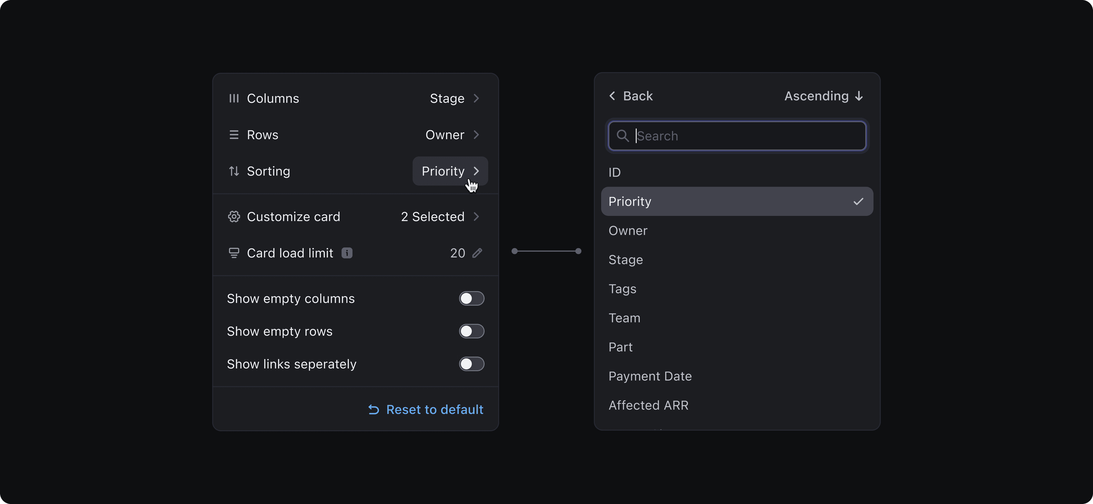
Customise card
Customising card attributes lets users focus on what matters, allowing them to see the most relevant details for each object. They can also reorder attributes to control what appears first.
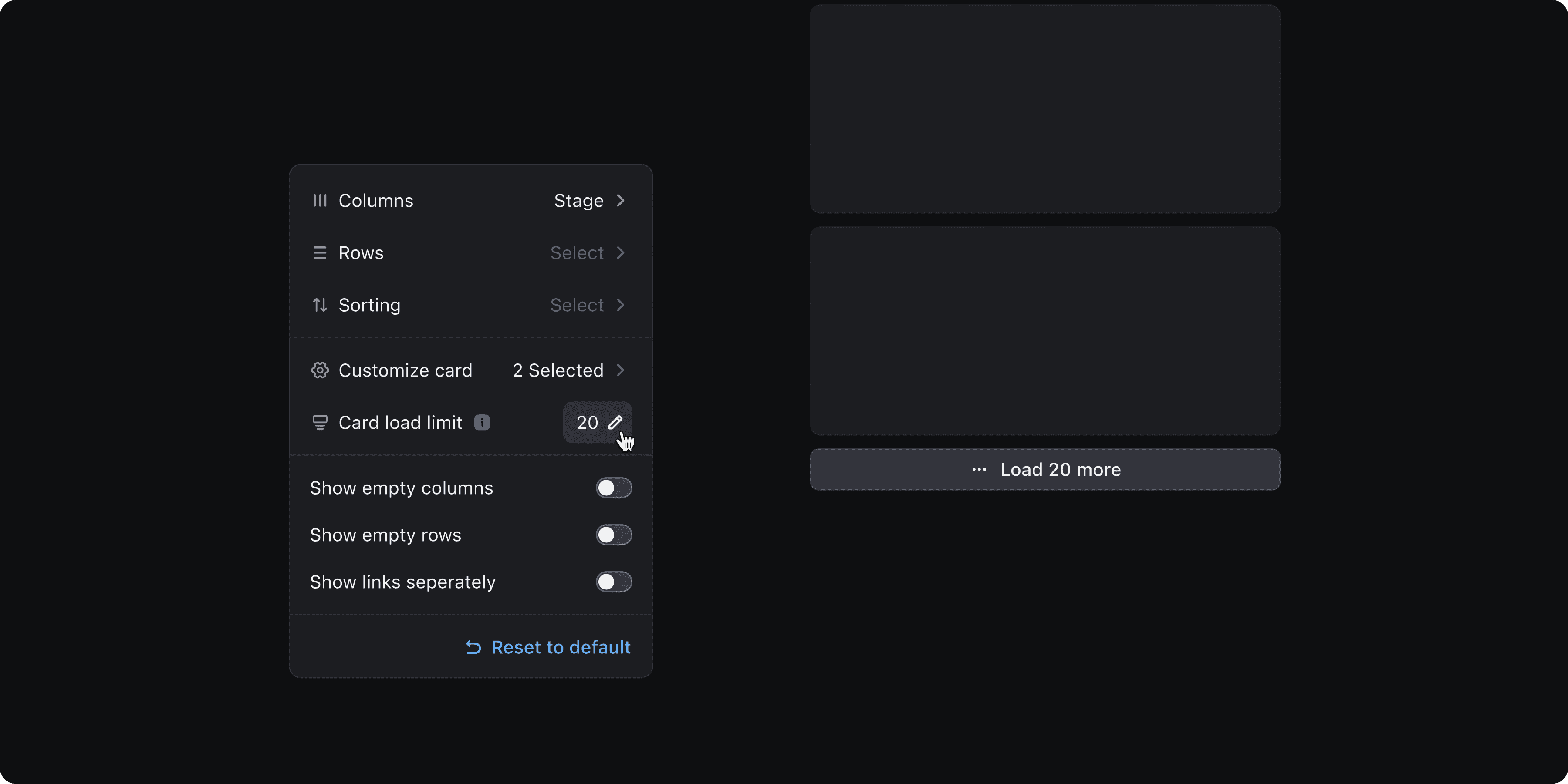
Column load limit
After discussions with our design head and engineering team, I realised that users can’t effectively prioritise more than 20 cards per column at a glance. More than that, and both cognitive load and UI performance start to take a hit.
To strike the right balance, we introduced a column load limit with the flexibility to adjust. Users can change the limit based on their needs, and a “Load More” button lets them pull in additional cards on demand. This is a performance-conscious design that still respects user freedom.
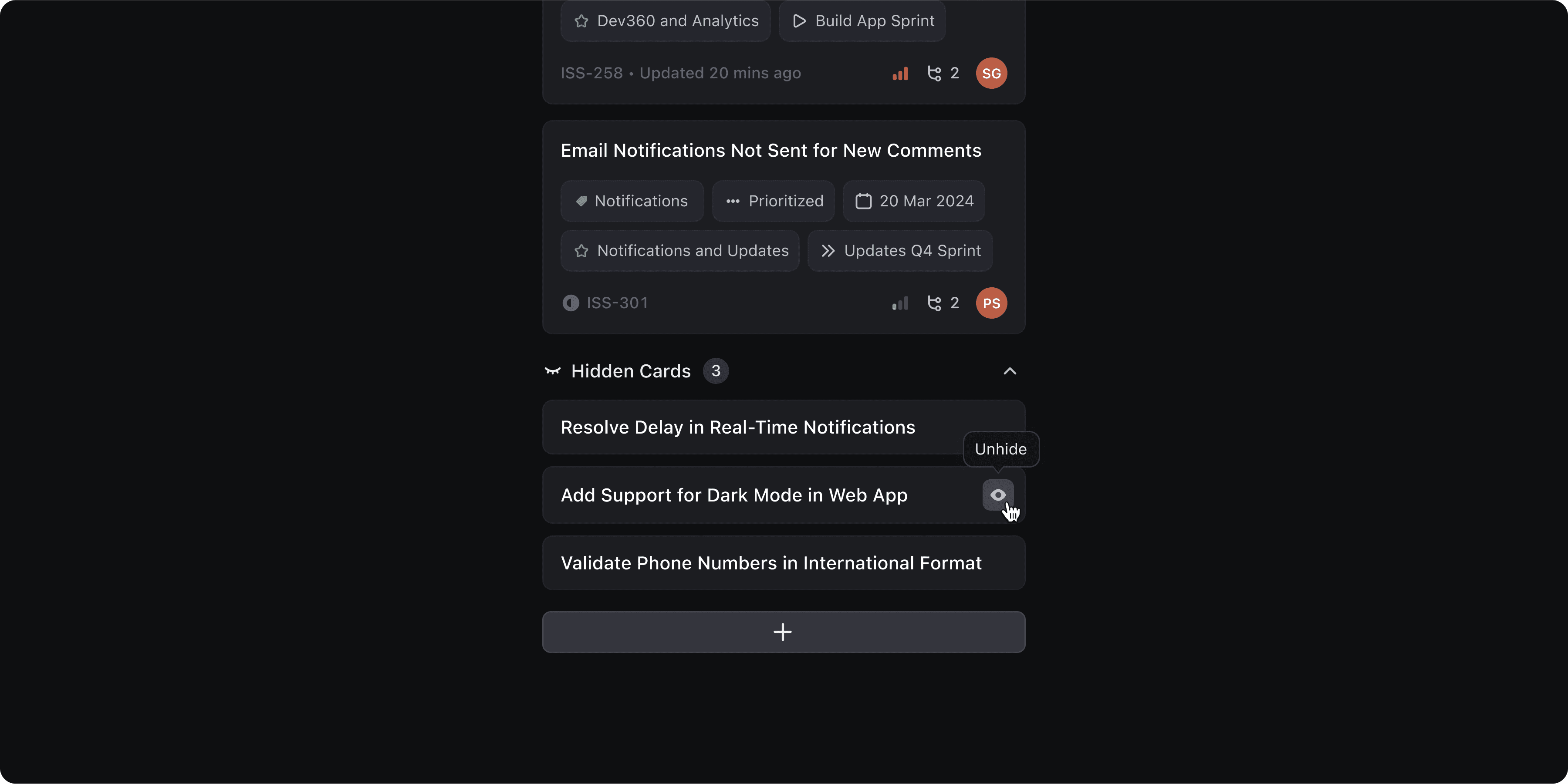
Hide Stuff
To keep the board focused, we added options that let users hide empty columns and rows clearing out space that doesn’t need attention.
Users can also choose to toggle links visibility. Turning this on displays the parent issue and its child dependencies as separate cards on the board, giving a clearer picture of total work items.

For moments when things get too customised or just off track, we added an option to reset all board settings. With one click, users can revert to the default layout and attribute setup.

When users choose to hide a card, it’s simply moved to a “Hidden Cards” group at the bottom of the column. From there, users can review and unhide cards anytime.
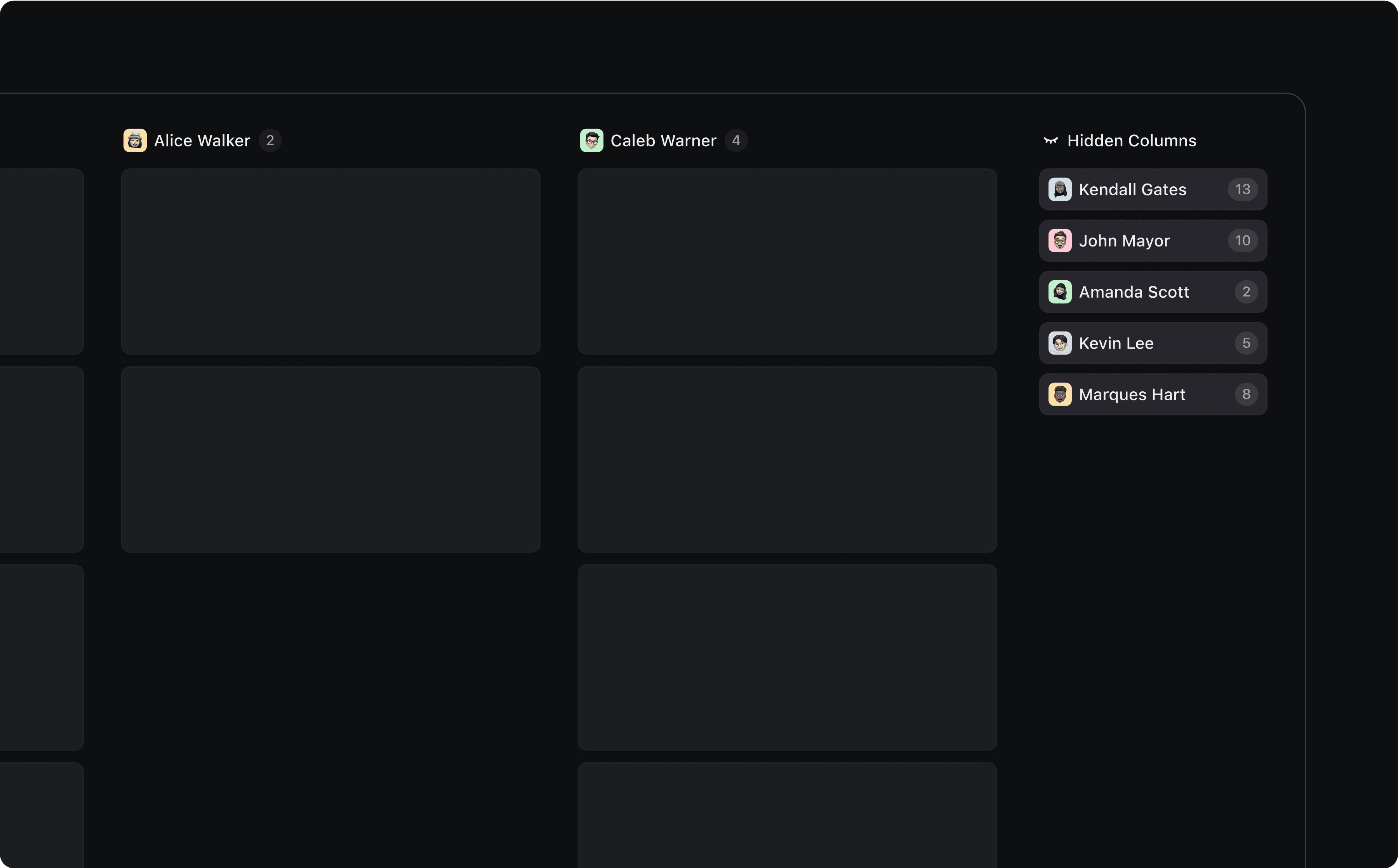
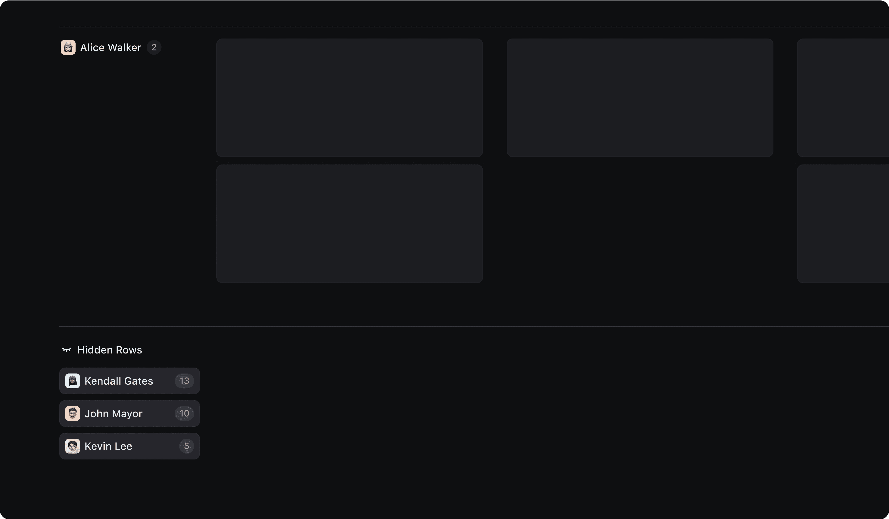
The same logic applies to hidden columns and rows. Hidden columns are collected in a dedicated section at the end of the board. Clicking on a column name instantly restores it to its original position, and the view automatically shifts to bring it into focus so users never feel disoriented.
Rows follow the same pattern, making hiding and unhiding a smooth, intuitive experience across the board.
Quick Controls
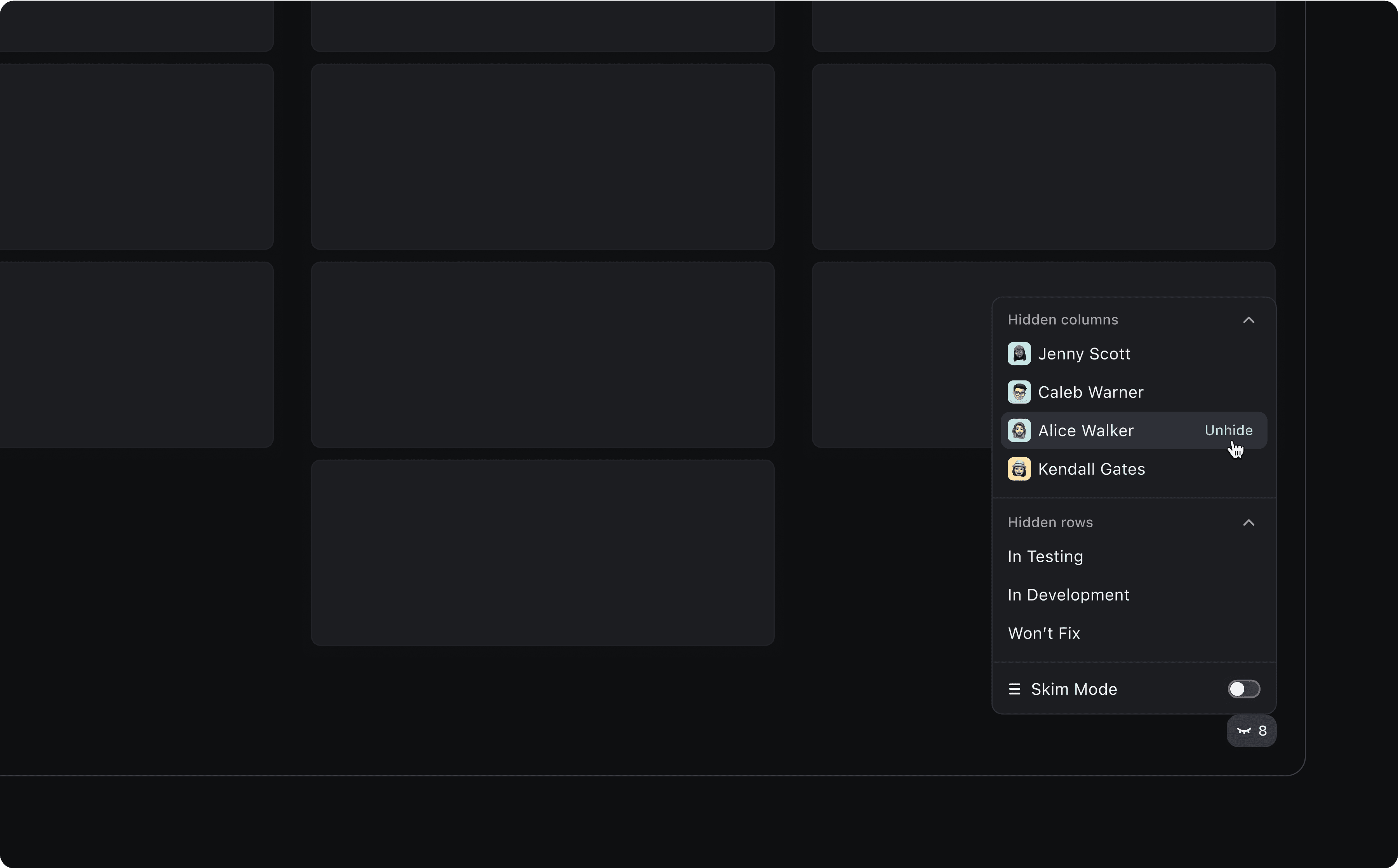
As hidden rows and columns move to the far ends of the board, it became clear that navigating just to unhide them created friction. Users often lost track of where columns reappeared, and scrolling back and forth to the hidden section isn't ideal.
To solve this, I introduced Quick Controls: a small, sticky button in the bottom-right corner of the board that displays the combined count of hidden rows + columns.
Clicking it reveals a dropdown list of all hidden elements, allowing users to unhide any item with a single click. The view adjusts automatically, and the controls remain persistent after each action, so users can make multiple changes without interruption. The menu can be closed by simply clicking outside.
To further enhance this experience, I also introduced a new capability called Skim Mode: designed to give users a faster way to scan and manage work items.
Skim Mode
While rich cards with attributes and insights offer valuable context, they can make it hard to scan the board quickly, especially when dealing with long columns.
To solve this, I designed Skim Mode.
When enabled, Skim Mode hides all attributes and the insights tray, showing only the card title. This dramatically reduces card height and lets users view significantly more cards at a glance, making it easier to scan, prioritise, and spot patterns across the board.
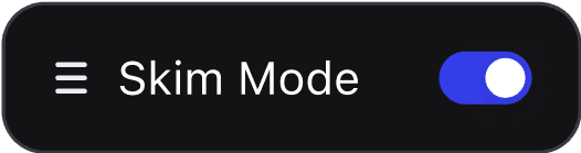
But Skim Mode goes beyond just hiding content. Users can also expand individual cards to view more details without switching modes. The expand/collapse state is preserved, allowing users to keep multiple cards open at once, perfect for side-by-side comparisons or focused review.
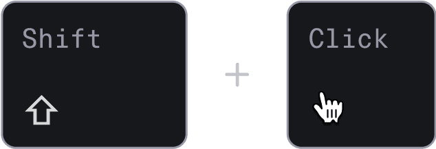
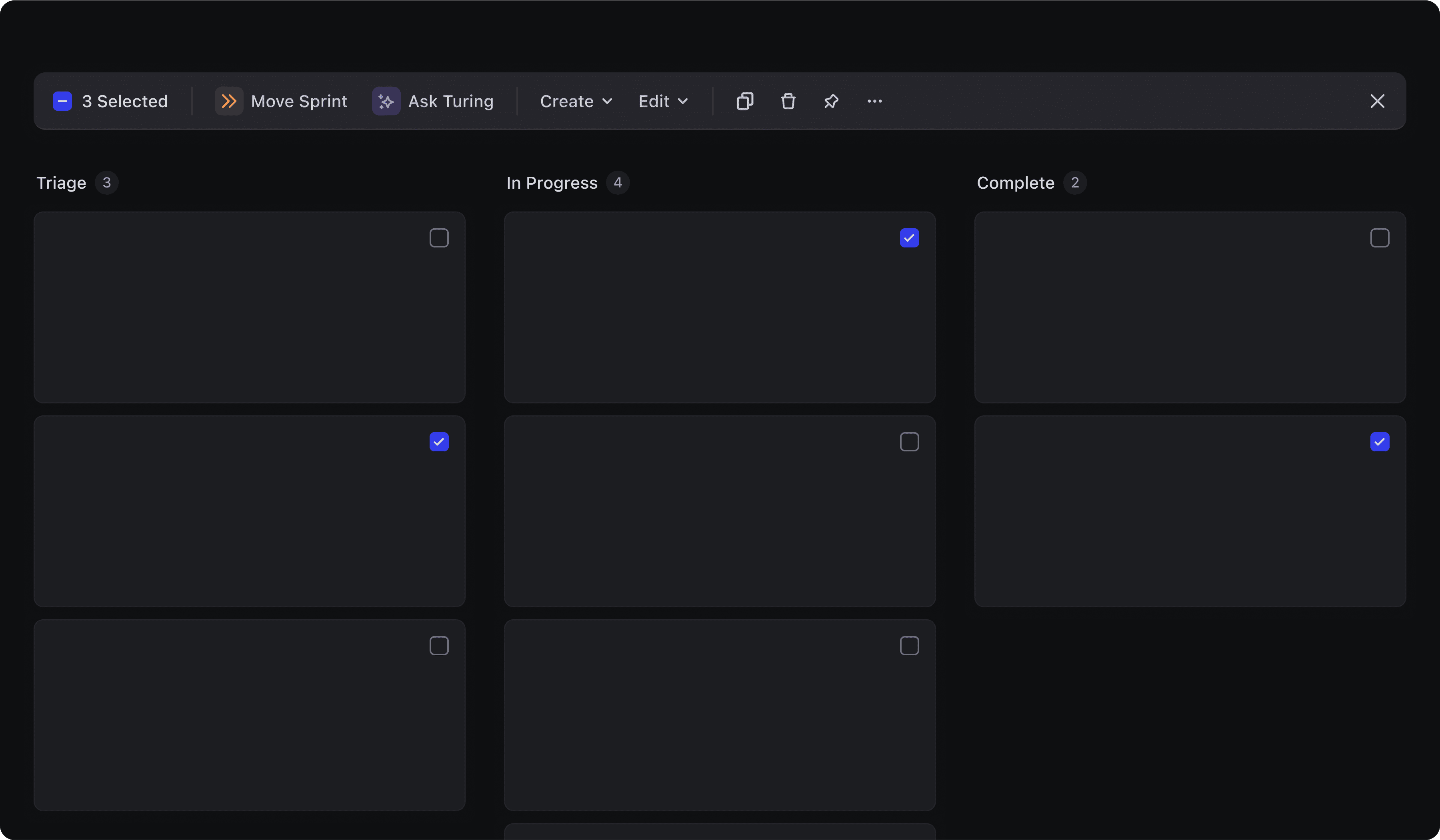
Bulk Mode
When users need to make the same change across multiple cards, like updating priorities, reassigning ownership: Bulk Mode steps in.
It can be triggered by selecting the “Select” option from any card’s controls, or using the “Select All” option from column controls. Once active, all cards display a checkbox, clearly signeling that Bulk Mode is on.
Users can also trigger bulk mode using a simple shortcut: Shift + Click.
Tool Bar
Once cards are selected in Bulk Mode, a toolbar appears at the top, bringing all key actions into one place.
From here, users can move issues to sprints, bulk edit attributes, create or link new objects, copy links, pin items, delete, and more. It’s designed to support high-efficiency workflows, helping users take bulk actions without leaving the board.
Cosiderations
After in-depth discussions with our design head, dev team, and internal users, we arrived at a key insight: users don’t come to Board View to see everything, they come to organize, prioritize, and act.
For scanning or reviewing the full list of items, List View is more effective: it’s linear, compact, and easier to parse in bulk. Board View, on the other hand, shines when users want to work within focused buckets, move items around, and see progress at a glance.
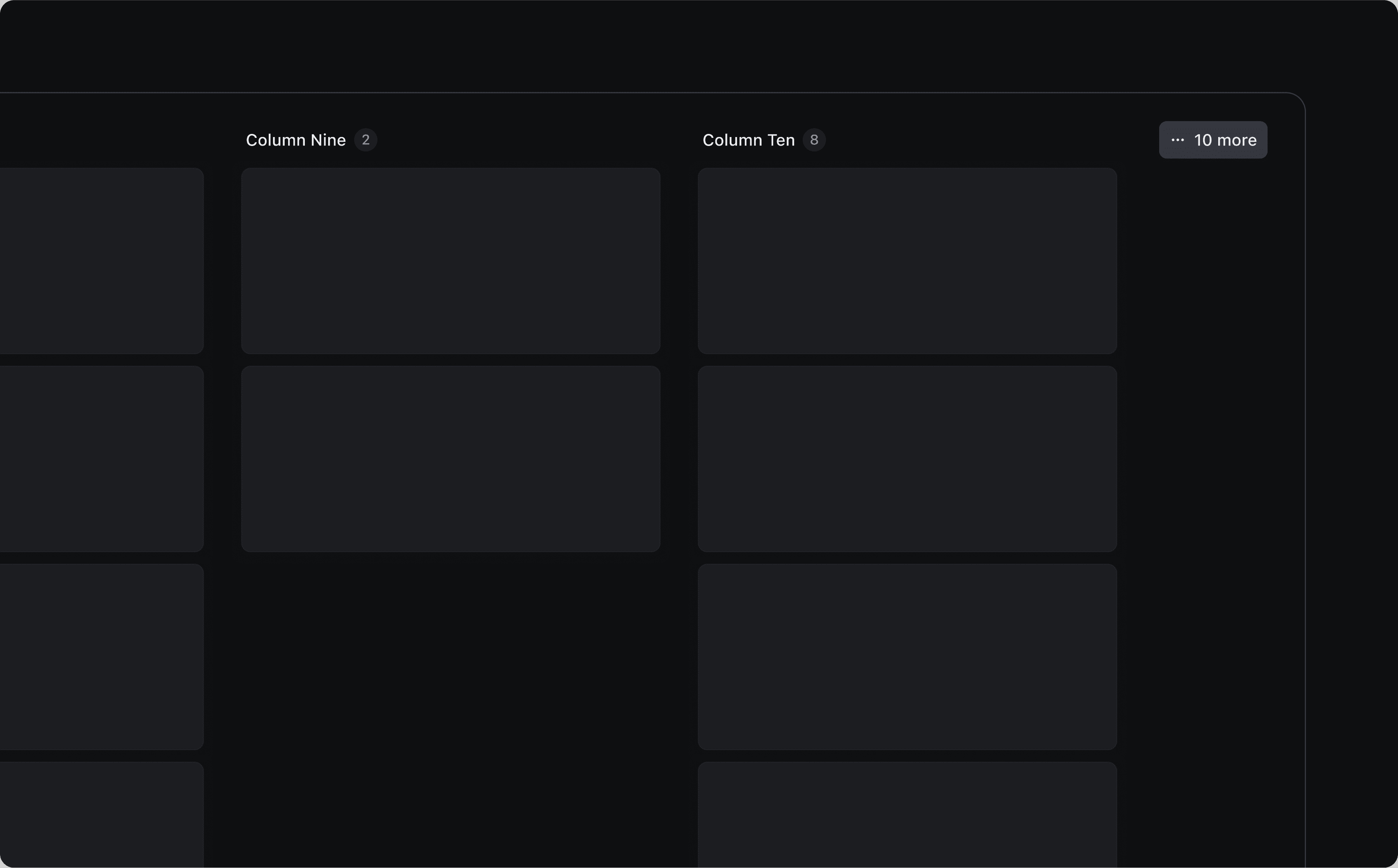
With that in mind, we chose to load 10 columns and 10 rows by default. This keeps the interface snappy, reduces UI strain, and focuses the experience around action, not overwhelm.
At the same time, we respected user control by adding a “Load More” option, letting users pull in additional columns and rows on demand, as needed.
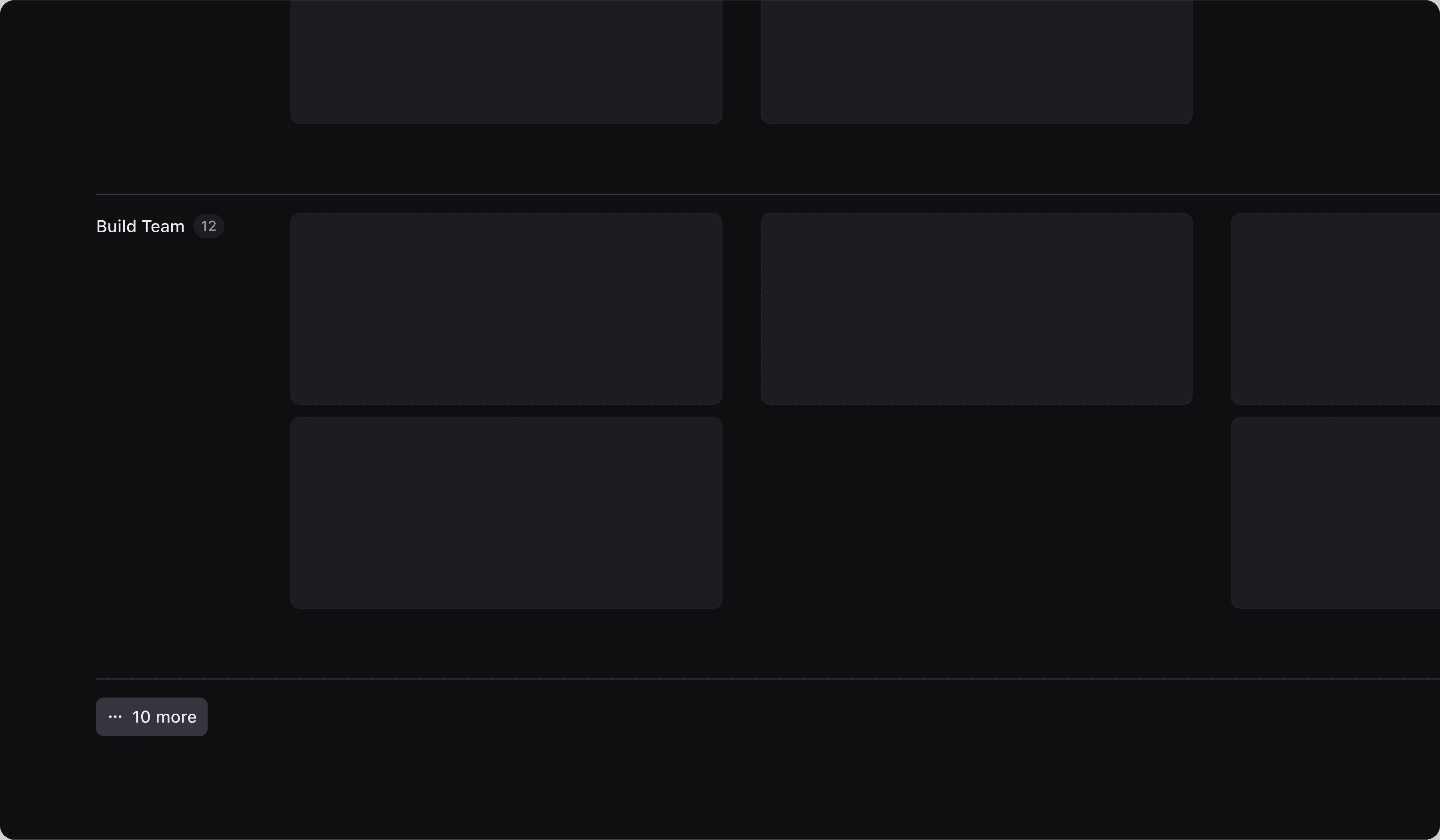
For the same reason, we introduced a limit of 8 attributes per card. This keeps cards visually digestible and minimises rendering overhead, ensuring the board remains fast and readable, even with dense data.
Sort by
Sorting on a board helps bring structure but it also introduces a challenge when moving cards across columns. Should the card follow the board’s sort order? Or land exactly where the user drops it?
To support both behaviours, I designed a hover state on the column that clearly indicates the current sort logic, letting users know that cards will be automatically sorted by default.
But for those who prefer control, holding Command (⌘) reveals the actual card list and enables manual placement. This gives users the best of both worlds: a board that stays structured by default, but flexible when needed.


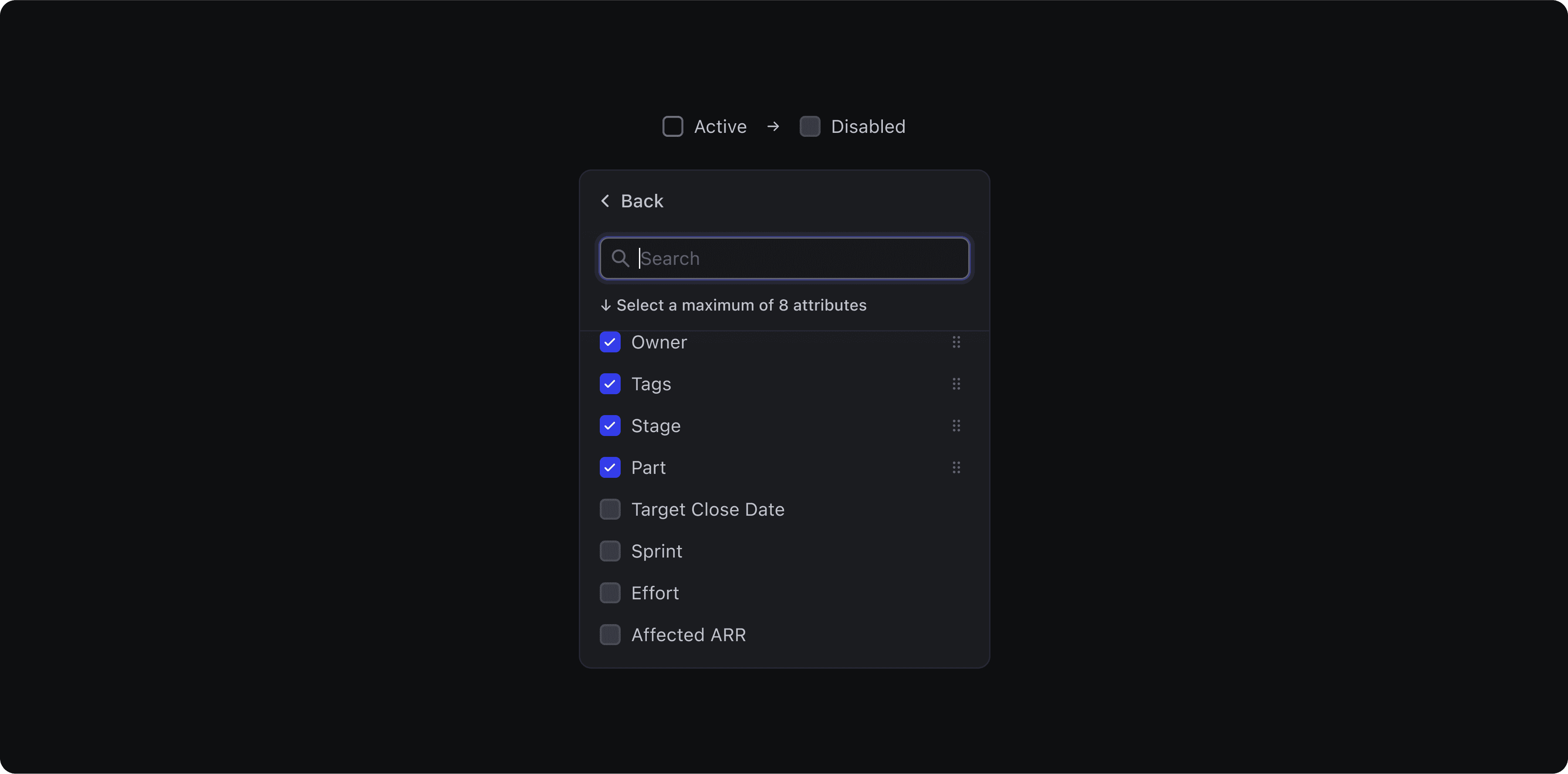
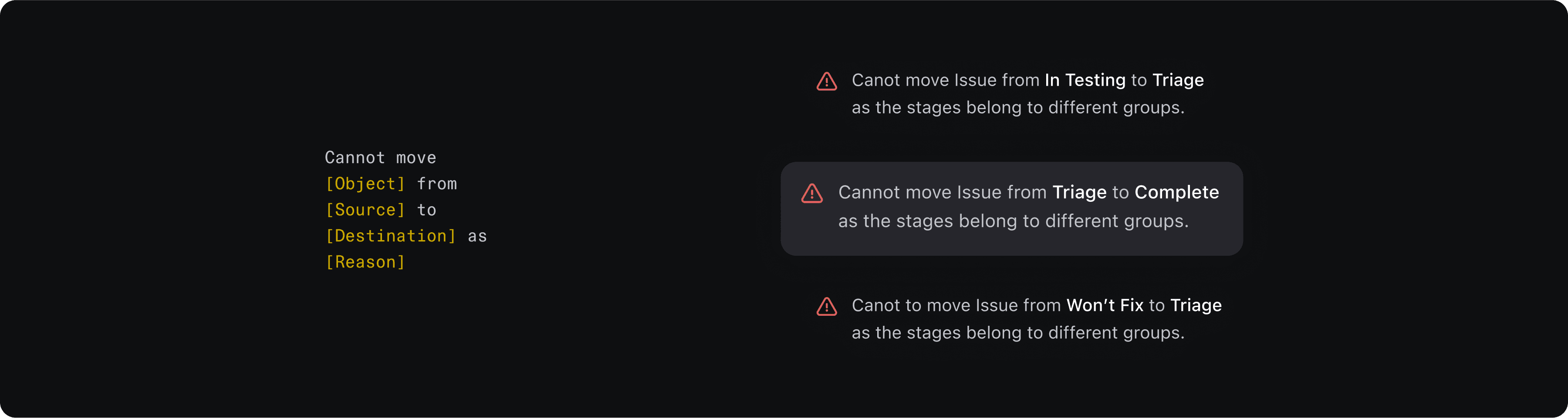
DevRev Restriction
In DevRev, certain attributes; like stage are category-driven by design. For example, an issue can’t jump directly from Triage to Complete. It must first pass through In Progress, enforcing a structured workflow.
While we’re actively working on a more flexible setting that would let users define this behaviuor, it requires changes at the platform level.
As an interim solution, I designed a dynamic visual warning and supporting framework to communicate these restrictions in real time. This helps users understand why a move may not work.
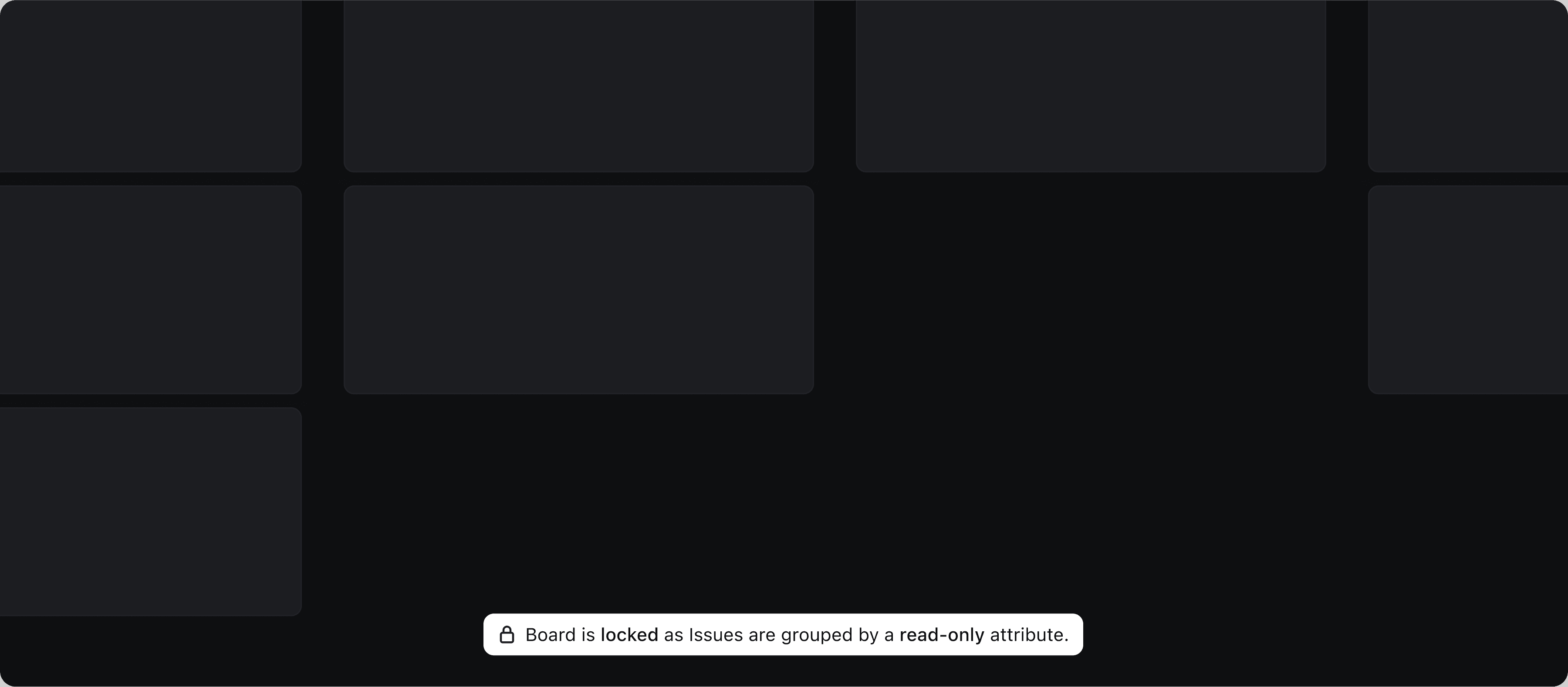
Non-editable fields
When cards are grouped by a read-only system attribute, users aren’t allowed to move cards between columns. However, reordering within the same column remains fully supported.
To prevent confusion, I designed a clear warning message and a subtle overlay that appears when users attempt to drag a card outside it's column.
The AI Bit
AI features in Board View are designed to support decision-making. Whether it’s sorting, clustering, or prioritising work, Turing AI steps in to help without ever taking control away from the user.
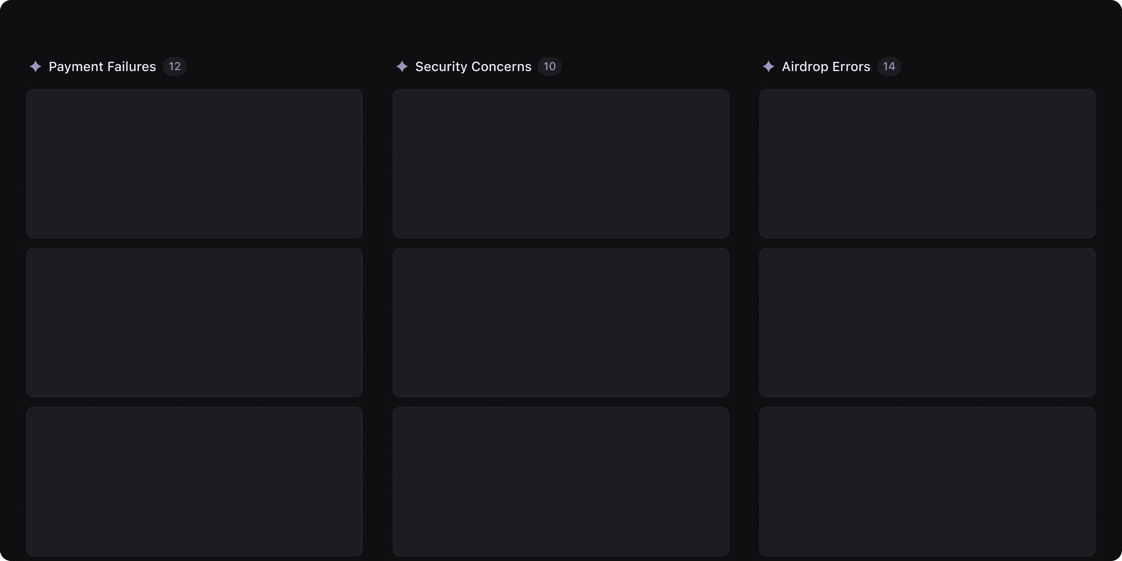
Smart Cluster
Smart Cluster leverages DevRev’s Knowledge Graph and AI capabilities to automatically identify similar themes across objects and groups them into meaningful clusters.
Users can enable it by selecting Smart Cluster from the column or row grouping options. It’s a quick, intelligent way to uncover patterns without manual setup.
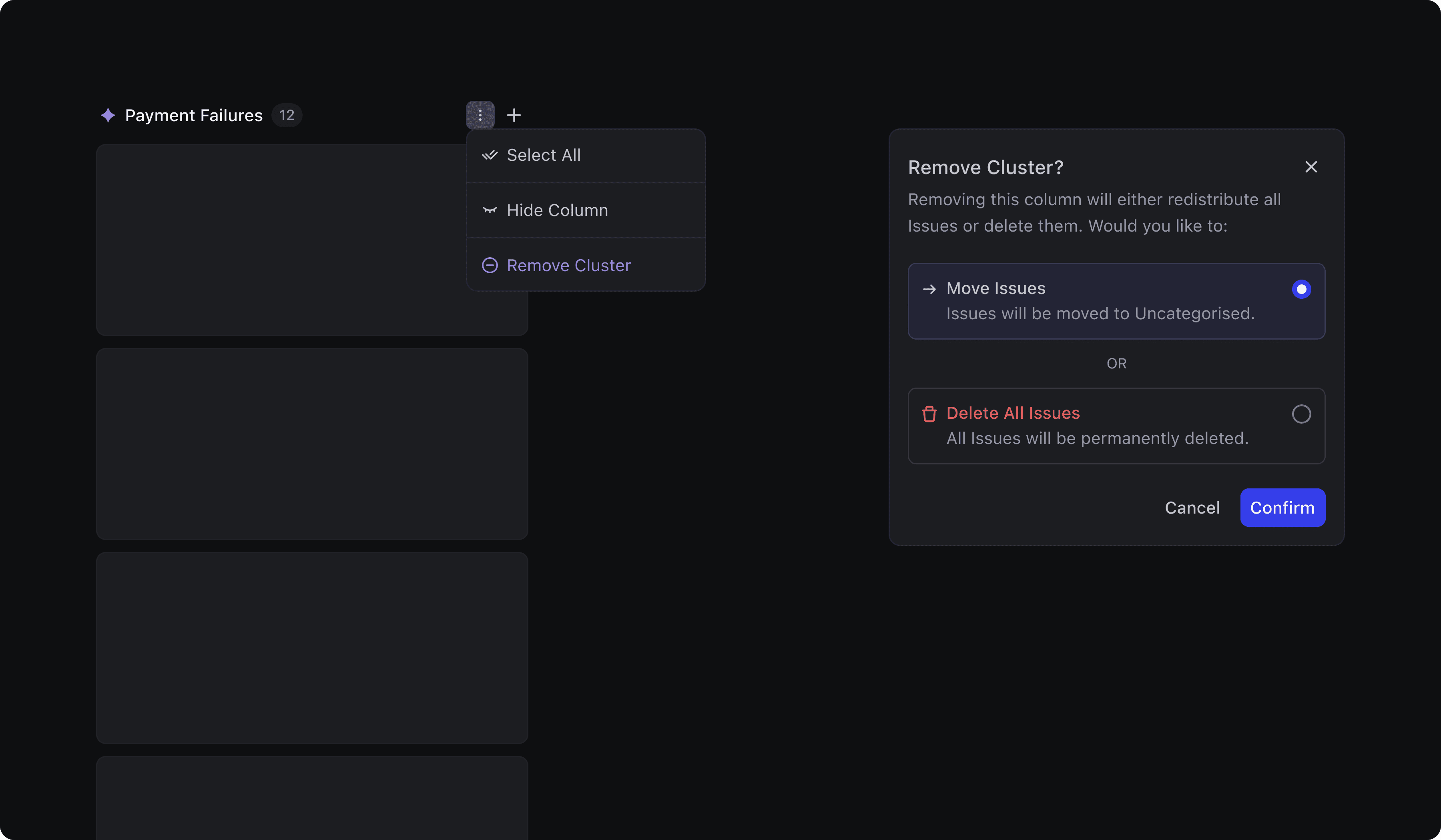
Smart Clusters are visually marked with an AI icon next to the column title. When enabled, the board also includes an “Uncategorised” column used to surface issues that the system couldn’t confidently assign to any cluster. This gives users a clear view of what still needs manual attention.
To give users more control over Smart Clusters, I designed a clear step before removing any cluster column. When deleting a cluster, users can choose to either delete all issues (if the group feels irrelevant) or move all issues to the “Uncategorised” column to preserve them.
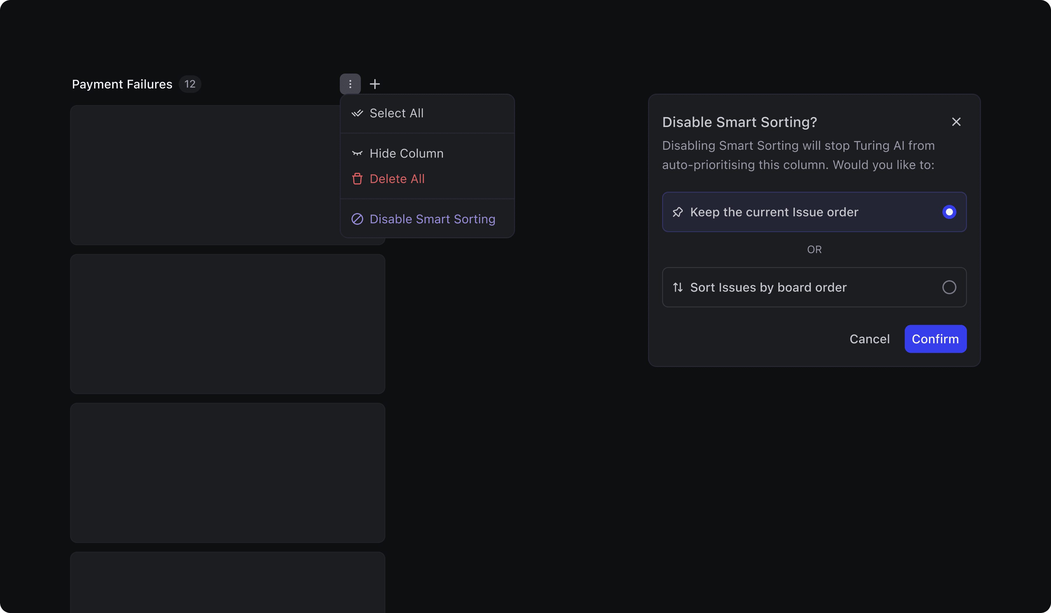
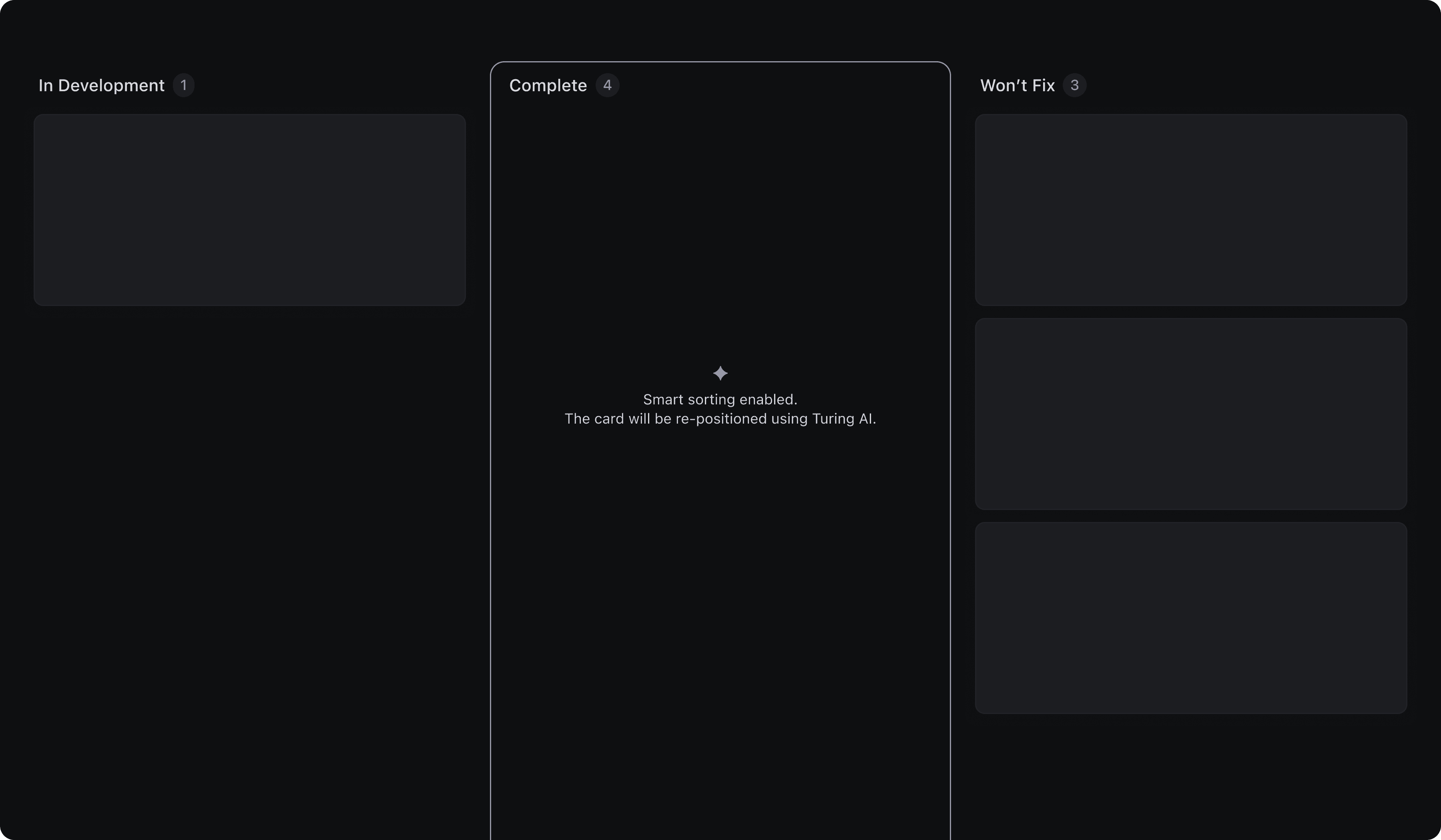
Smart Sorting
Smart Sorting uses AI to contextually prioritise items within a column. It can be enabled globally from the Sorting menu, or applied to an individual column via the three-dot menu.
To keep users informed while AI is at work, I designed a subtle loading animation.
Users can disable Smart Sorting directly from the purple dot indicator on the column, or through the column controls menu. When turning it off, they’re given a choice: either Keep the current issue order in the column or reapply the board’s global sorting attribute.
Similar to the standard sorting interaction, users can still move cards into columns with Smart Sorting enabled. I designed a similar info message to notify them of the active sorting logic.
Smart Prioritise
Smart Prioritise uses Turing AI to automatically reposition a card within a column. It’s a helpful fallback for those “I’m not sure where this goes” moments.

Agent x Board
The Agent-Board interaction begins when users toggle AI Assist Mode within the Board view. The design approach was to make the Agent feel embedded, so it could support users wherever they are on the board.
When paired with Focus Mode, it creates a space where users can zero in on a single issue without distraction.
Book a call
to know more

Conclusion
What began as a kanban-style interface quickly evolved into a deeply integrated, intelligent workspace, tailored for the way DevRev users manage work.
The challenge was more than visualising issues in columns, it was about designing a board that could scale across object types, adapt to custom workflows, and remain fast and focused.
Edge cases like non-editable fields, hidden rows, and restricted transitions weren’t treated as exceptions but as core flows that deserved thoughtful interaction patterns. Every small interaction was carefully crafted to reduce friction, offer control, and support informed decisions.
Big thanks to Priyanka, Priyadarshan, Satyam and Diwyanshu for bridging the gap between what’s technically possible and what users really need.